翻译整理自:Top 50 ggplot2 Visualizations - The Master
List,有删改。
最后一部分了,希望一次完成🙈️。拖这么久主要是后面有些图不是很常用,所以没什么动力去仔细看。
4. Distribution
当数据量很大,我们只想看看数据分布情况。
Histogram
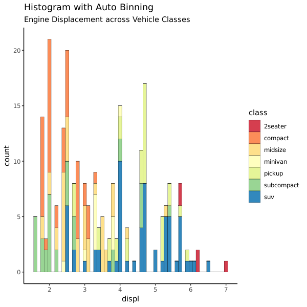
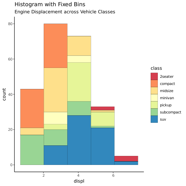
默认情况下,如果传给 ggplot2 只有一个参数,geom_bar() 会尝试将对这一列数据进行计数然后用计数来画条图。如果数据本身就是数值(不是数量)想用来直接画条图,可以使用 stat=identity 参数,但这个时候必须同时有 x/y 两个数据。
Histogram on a continuous variable
geom_bar() 或 geom_histogram() 多可以用来针对连续变量画条图。geom_histogram() 可以用 bins 参数控制图条的数量,也可以用 binwidth 设置图条对应的区间宽度。也因为 geom_histogram() 的参数更加灵活,所以画直方图是推荐用它的。
 1
 2
 3
 4
 5
 6
 7
 8
 9
10
11
12
13
14
15
16
17
18
|
library(ggplot2)
theme_set(theme_classic())

# Histogram on a Continuous (Numeric) Variable
g <- ggplot(mpg, aes(displ)) + scale_fill_brewer(palette = "Spectral")
g + geom_histogram(aes(fill=class),
                   binwidth = .1,
                   col="black",
                   size=.1) +  # change binwidth
    labs(title="Histogram with Auto Binning",
         subtitle="Engine Displacement across Vehicle Classes")

g + geom_histogram(aes(fill=class),
                   bins=5,
                   col="black",
                   size=.1) +   # change number of bins
    labs(title="Histogram with Fixed Bins",
         subtitle="Engine Displacement across Vehicle Classes")
|
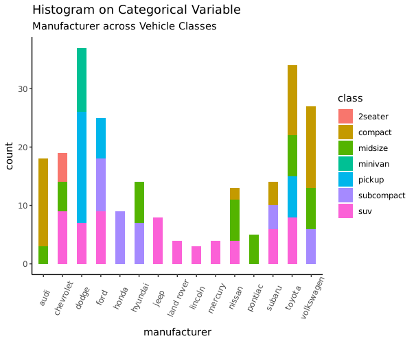
Histogram on a categorical variable
对分类变量画条图会得到各个类别的计数情况。通过调整 width 参数可以控制图条的宽度。
1
2
3
4
5
6
7
8
|
library(ggplot2)
theme_set(theme_classic())
# Histogram on a Categorical variable
g <- ggplot(mpg, aes(manufacturer))
g + geom_bar(aes(fill=class), width = 0.5) +
    theme(axis.text.x = element_text(angle=65, vjust=0.6)) +
    labs(title="Histogram on Categorical Variable",
         subtitle="Manufacturer across Vehicle Classes")
|
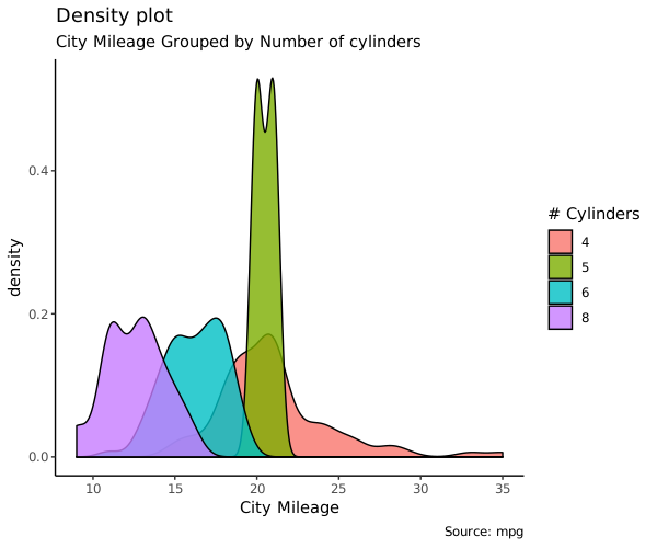
Density plot
密度图一般用来看连续性变量分布情况
 1
 2
 3
 4
 5
 6
 7
 8
 9
10
|
library(ggplot2)
theme_set(theme_classic())
# Plot
g <- ggplot(mpg, aes(cty))
g + geom_density(aes(fill=factor(cyl)), alpha=0.8) +
    labs(title="Density plot",
         subtitle="City Mileage Grouped by Number of cylinders",
         caption="Source: mpg",
         x="City Mileage",
         fill="# Cylinders")
|
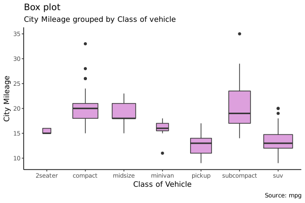
Box Plot
箱式图也是展示数据分布的好办法。箱式图同时展示了中位数、上下限以及离群点:箱子内的横线是中位数,上下边分别是 75% 和 25% 分位值,箱子两端上下的线表示 1.5*IQR (Inter Quartile Range,表示 25% 和 75% 之间的距离),这之外的数据一般用点画出来,表示离群点。
varwidth=TRUE 可以让箱子的宽度反映出箱子代表的数据点的多少。
 1
 2
 3
 4
 5
 6
 7
 8
 9
10
|
library(ggplot2)
theme_set(theme_classic())
# Plot
g <- ggplot(mpg, aes(class, cty))
g + geom_boxplot(varwidth=T, fill="plum") +
    labs(title="Box plot",
         subtitle="City Mileage grouped by Class of vehicle",
         caption="Source: mpg",
         x="Class of Vehicle",
         y="City Mileage")
|
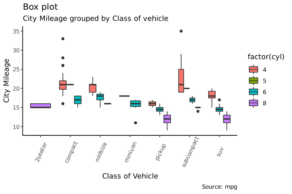
1
2
3
4
5
6
7
8
9
|
library(ggthemes)
g <- ggplot(mpg, aes(class, cty))
g + geom_boxplot(aes(fill=factor(cyl))) +
  theme(axis.text.x = element_text(angle=65, vjust=0.6)) +
  labs(title="Box plot",
       subtitle="City Mileage grouped by Class of vehicle",
       caption="Source: mpg",
       x="Class of Vehicle",
       y="City Mileage")
|
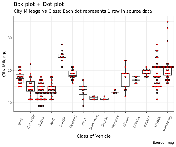
Dot + Box Plot
在箱式图的基础上,还可以把数据点叠加上来。
 1
 2
 3
 4
 5
 6
 7
 8
 9
10
11
12
13
14
15
16
|
library(ggplot2)
theme_set(theme_bw())

# plot
g <- ggplot(mpg, aes(manufacturer, cty))
g + geom_boxplot() +
  geom_dotplot(binaxis='y',
               stackdir='center',
               dotsize = .5,
               fill="red") +
  theme(axis.text.x = element_text(angle=65, vjust=0.6)) +
  labs(title="Box plot + Dot plot",
       subtitle="City Mileage vs Class: Each dot represents 1 row in source data",
       caption="Source: mpg",
       x="Class of Vehicle",
       y="City Mileage")
|
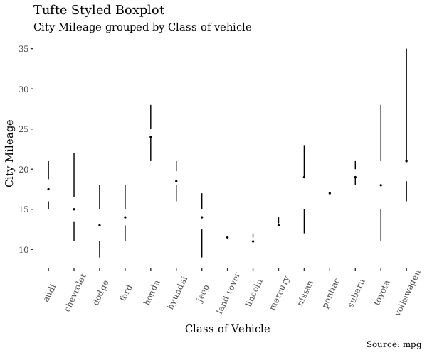
Tufte Boxplot
Tufte 箱式图是基于 Edward Tufte 的可视化理论的一种图,由 ggthemes 提供的。它是一种极简同时又更美观的箱式图。
 1
 2
 3
 4
 5
 6
 7
 8
 9
10
11
12
13
|
library(ggthemes)
library(ggplot2)
theme_set(theme_tufte())  # from ggthemes

# plot
g <- ggplot(mpg, aes(manufacturer, cty))
g + geom_tufteboxplot() +
      theme(axis.text.x = element_text(angle=65, vjust=0.6)) +
      labs(title="Tufte Styled Boxplot",
           subtitle="City Mileage grouped by Class of vehicle",
           caption="Source: mpg",
           x="Class of Vehicle",
           y="City Mileage")
|
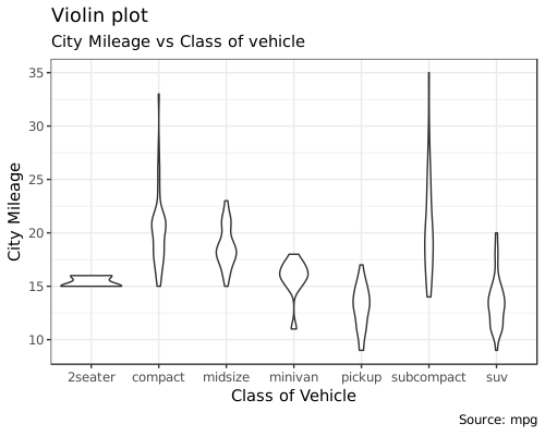
Violin Plot
小提琴图和箱式图类似,增加了数据的密度信息的展示,这是箱式图所没有的。
 1
 2
 3
 4
 5
 6
 7
 8
 9
10
11
|
library(ggplot2)
theme_set(theme_bw())

# plot
g <- ggplot(mpg, aes(class, cty))
g + geom_violin() +
  labs(title="Violin plot",
       subtitle="City Mileage vs Class of vehicle",
       caption="Source: mpg",
       x="Class of Vehicle",
       y="City Mileage")
|
Population Pyramid
人口金字塔,展示各类别人口或者人口百分比的一种图形。下面的图是展示的是邮件促销活动中各个阶段用户量的情况:
 1
 2
 3
 4
 5
 6
 7
 8
 9
10
11
12
13
14
15
16
17
18
19
20
21
22
23
24
25
|
library(ggplot2)
library(ggthemes)
options(scipen = 999)  # turns of scientific notations like 1e+40

# Read data
email_campaign_funnel <-
    read.csv(
        "https://raw.githubusercontent.com/selva86/datasets/master/email_campaign_funnel.csv"
    )

# X Axis Breaks and Labels
brks <- seq(-15000000, 15000000, 5000000)
lbls = paste0(as.character(c(seq(15, 0, -5), seq(5, 15, 5))), "m")

# Plot
ggplot(email_campaign_funnel, aes(x = Stage, y = Users, fill = Gender)) +   # Fill column
    geom_bar(stat = "identity", width = .6) +   # draw the bars
    scale_y_continuous(breaks = brks,   # Breaks
                       labels = lbls) + # Labels
    coord_flip() +  # Flip axes
    labs(title = "Email Campaign Funnel") +
    theme_tufte() +  # Tufte theme from ggfortify
    theme(plot.title = element_text(hjust = .5),
          axis.ticks = element_blank()) +   # Centre plot title
    scale_fill_brewer(palette = "Dark2")  # Color palette
|
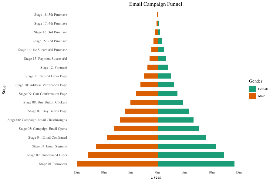
画这个图的技巧是把不同两组数据画条图在一幅图中,但是其中一个数值改为负值。
5. Composition
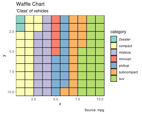
Waffle Chart
华夫图用来展示总体中不同类别组成情况的。ggplot 没有提供这个功能,但是我们可以用 geom_tile() 实现这个:
 1
 2
 3
 4
 5
 6
 7
 8
 9
10
11
12
13
14
15
16
17
18
19
20
21
22
23
24
25
26
27
28
29
|
var <- mpg$class  # the categorical data
## Prep data (nothing to change here)
nrows <- 10
df <- expand.grid(y = 1:nrows, x = 1:nrows)
categ_table <- round(table(var) * ((nrows * nrows) / (length(var))))
categ_table

df$category <- factor(rep(names(categ_table), categ_table))
# NOTE: if sum(categ_table) is not 100 (i.e. nrows^2), it will need adjustment to make the sum to 100.

## Plot
ggplot(df, aes(x = x, y = y, fill = category)) +
    geom_tile(color = "black", size = 0.5) +
    scale_x_continuous(expand = c(0, 0)) +
    scale_y_continuous(expand = c(0, 0), trans = 'reverse') +
    scale_fill_brewer(palette = "Set3") +
    labs(title = "Waffle Chart",
         subtitle = "'Class' of vehicles",
         caption = "Source: mpg") +
    theme(
        panel.border = element_rect(size = 2),
        plot.title = element_text(size = rel(1.2)),
        axis.text = element_blank(),
        axis.title = element_blank(),
        axis.ticks = element_blank(),
        legend.title = element_blank(),
        legend.position = "right"
    ) +
    theme_dark()
|
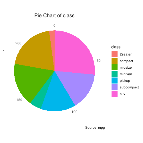
Pie Chart
饼图就很熟悉了。但是 ggplot2 画饼图有一点点小难,用到的是 coord_polar():
 1
 2
 3
 4
 5
 6
 7
 8
 9
10
11
12
13
14
15
16
17
18
19
|
library(ggplot2)
theme_set(theme_classic())

# Source: Frequency table
df <- as.data.frame(table(mpg$class))
colnames(df) <- c("class", "freq")
pie <- ggplot(df, aes(x = "", y = freq, fill = factor(class))) +
    geom_bar(width = 1, stat = "identity") +
    theme(axis.line = element_blank(),
          plot.title = element_text(hjust = 0.5)) +
    labs(
        fill = "class",
        x = NULL,
        y = NULL,
        title = "Pie Chart of class",
        caption = "Source: mpg"
    )

pie + coord_polar(theta = "y", start = 0)
|
这是当数据是频数资料的时候的画法。下面则是数据是原始分类数据的时候的画法:
 1
 2
 3
 4
 5
 6
 7
 8
 9
10
11
12
13
14
15
|
# Source: Categorical variable.
# mpg$class
pie <- ggplot(mpg, aes(x = "", fill = factor(class))) +
    geom_bar(width = 1) +
    theme(axis.line = element_blank(),
          plot.title = element_text(hjust = 0.5)) +
    labs(
        fill = "class",
        x = NULL,
        y = NULL,
        title = "Pie Chart of class",
        caption = "Source: mpg"
    )

pie + coord_polar(theta = "y", start = 0)
|
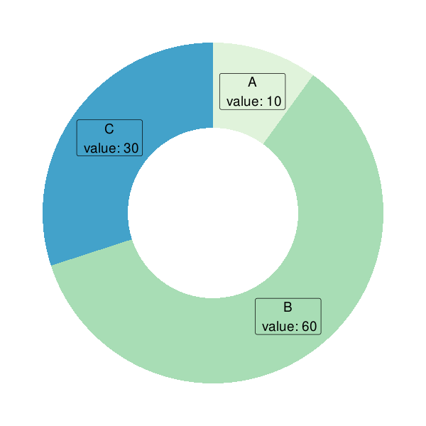
和饼图类似的是甜甜圈图(Donut plot),下面的例子来自 Most basic doughnut chart with ggplot2(这个帖子也很有意思,值得一看):
 1
 2
 3
 4
 5
 6
 7
 8
 9
10
11
12
13
14
15
16
17
18
19
20
21
22
23
24
25
26
27
28
29
30
31
32
33
|
# load library
library(ggplot2)
# Create test data.
data <- data.frame(category = c("A", "B", "C"),
                   count = c(10, 60, 30))
# Compute percentages
data$fraction <- data$count / sum(data$count)
# Compute the cumulative percentages (top of each rectangle)
data$ymax <- cumsum(data$fraction)
# Compute the bottom of each rectangle
data$ymin <- c(0, head(data$ymax, n = -1))
# Compute label position
data$labelPosition <- (data$ymax + data$ymin) / 2
# Compute a good label
data$label <- paste0(data$category, "\n value: ", data$count)

# Make the plot
ggplot(data, aes(
    ymax = ymax,
    ymin = ymin,
    xmax = 4,
    xmin = 3,
    fill = category
)) +
    geom_rect() +
    geom_label(x = 3.5,
               aes(y = labelPosition, label = label),
               size = 5) +
    scale_fill_brewer(palette = 4) +
    coord_polar(theta = "y") +
    xlim(c(2, 4)) +
    theme_void() +
    theme(legend.position = "none")
|
Treemap
略。
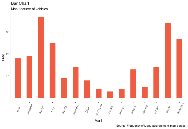
Bar Chart
默认情况下,geom_bar() 的 stat 设置为 count。这导致当只提供一个连续型数据作为 X 变量而不提供 Y 时会得到一个直方图。要画直条图而不是直方图,需要两个数据:
- 设置
stat = identity
- 提示提供 X 和 Y 并且设置到
aes() 里,X 是因子型或者字符型,Y 是数值型。
直接用一列分类型数据或者整理好的频数表都可以画条图。width 参数可以调整条的宽度。如果数据已经是整理好的频数资料,那就需要在 geom_bar() 里设置 stat = identity。
 1
 2
 3
 4
 5
 6
 7
 8
 9
10
11
12
13
14
15
16
17
18
19
20
21
|
library("ggplot2")
# prep frequency table
freqtable <- table(mpg$manufacturer)
df <- as.data.frame.table(freqtable)
head(df)
#        Var1 Freq
# 1      audi   18
# 2 chevrolet   19
# 3     dodge   37
# 4      ford   25
# 5     honda    9
# 6   hyundai   14

theme_set(theme_classic())
# Plot
g <- ggplot(df, aes(Var1, Freq))
g + geom_bar(stat = "identity", width = 0.5, fill = "tomato2") +
    labs(title = "Bar Chart",
         subtitle = "Manufacturer of vehicles",
         caption = "Source: Frequency of Manufacturers from 'mpg' dataset") +
    theme(axis.text.x = element_text(angle = 65, vjust = 0.6))
|
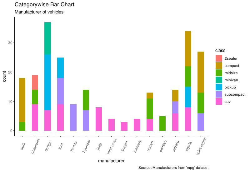
其实不提供计算好的频数表,ggplot 也能自己计算频数然后画图。这时候只需要提供 X 变量就可以,同时不要设置 stat = identity:
1
2
3
4
5
6
7
|
# From on a categorical column variable
g <- ggplot(mpg, aes(manufacturer))
g + geom_bar(aes(fill = class), width = 0.5) +
    theme(axis.text.x = element_text(angle = 65, vjust = 0.6)) +
    labs(title = "Categorywise Bar Chart",
         subtitle = "Manufacturer of vehicles",
         caption = "Source: Manufacturers from 'mpg' dataset")
|
6. Change
这里的改变都是指随时间改变的时间序列数据。
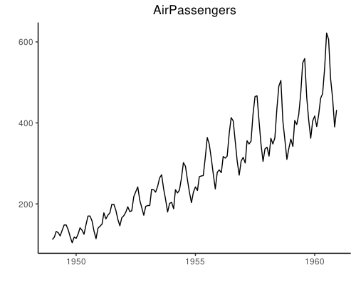
Time Series Plot From a Time Series Object (ts)
ggfortify 包可以识别时间序列对象直接自动作图:
1
2
3
4
5
6
7
8
9
|
## From Timeseries object (ts)
library("ggplot2")
library("ggfortify")
theme_set(theme_classic())

# Plot
autoplot(AirPassengers) +
    labs(title = "AirPassengers") +
    theme(plot.title = element_text(hjust = 0.5))
|
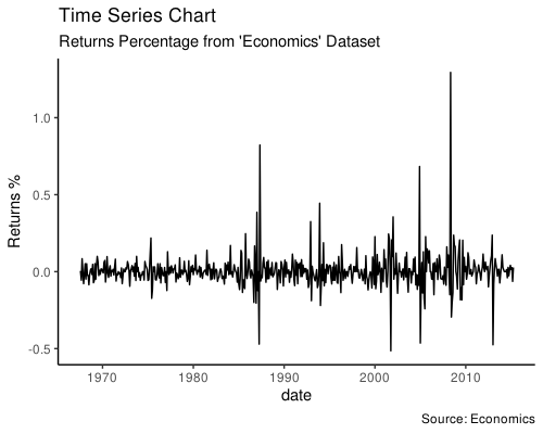
Time Series Plot From a Data Frame
geom_line() 可以直接使用数据框画时间序列的线图。这时候 X 轴会根据数据自动生成。下面的例子里 X 轴自动在每 10 年的位置生成了一个刻度。
 1
 2
 3
 4
 5
 6
 7
 8
 9
10
11
12
13
14
15
16
17
18
19
20
21
22
23
24
25
26
|
library("ggplot2")
theme_set(theme_classic())

data("economics")
head(economics)
# # A tibble: 6 x 6
#   date         pce    pop psavert uempmed unemploy
#   <date>     <dbl>  <dbl>   <dbl>   <dbl>    <dbl>
# 1 1967-07-01  507. 198712    12.6     4.5     2944
# 2 1967-08-01  510. 198911    12.6     4.7     2945
# 3 1967-09-01  516. 199113    11.9     4.6     2958
# 4 1967-10-01  512. 199311    12.9     4.9     3143
# 5 1967-11-01  517. 199498    12.8     4.7     3066
# 6 1967-12-01  525. 199657    11.8     4.8     3018

economics$returns_perc <-
    c(0,
      diff(economics$psavert) / economics$psavert[-length(economics$psavert)])
# Allow Default X Axis Labels
ggplot(economics, aes(x = date)) +
    geom_line(aes(y = returns_perc)) +
    labs(
        title = "Time Series Chart",
        subtitle = "Returns Percentage from 'Economics' Dataset",
        caption = "Source: Economics",
        y = "Returns %")
|
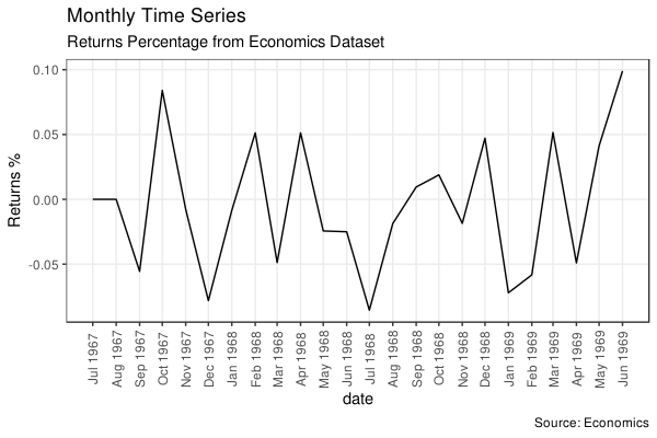
Time Series Plot For a Monthly Time Series
如果对自动生成的时间刻度不满意,可以用 scale_x_date() 分别指定 breaks 和 labels 来设置新的 X 轴:
 1
 2
 3
 4
 5
 6
 7
 8
 9
10
11
12
13
14
15
16
17
18
19
20
21
22
23
24
25
26
27
|
library("ggplot2")
library("lubridate")
theme_set(theme_bw())

economics_m <- economics[1:24,]

# labels and breaks for X axis text
lbls <-
    paste0(month.abb[month(economics_m$date)],
           " ",
           lubridate::year(economics_m$date))
brks <- economics_m$date

# plot
ggplot(economics_m, aes(x = date)) +
    geom_line(aes(y = returns_perc)) +
    labs(
        title = "Monthly Time Series",
        subtitle = "Returns Percentage from Economics Dataset",
        caption = "Source: Economics",
        y = "Returns %"
    ) +  # title and caption
    scale_x_date(labels = lbls,
                 breaks = brks) +  # change to monthly ticks and labels
    theme(axis.text.x = element_text(angle = 90, vjust = 0.5),
          # rotate x axis text
          panel.grid.minor = element_blank())  # turn off minor grid
|
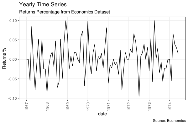
Time Series Plot For a Yearly Time Series
既然能自定义为按月作图,自然也就可以定义为按年作图了。做法和上面一样:
 1
 2
 3
 4
 5
 6
 7
 8
 9
10
11
12
13
14
15
16
17
18
19
20
21
22
23
24
|
library("ggplot2")
library("lubridate")
theme_set(theme_bw())

economics_y <- economics[1:90,]

# labels and breaks for X axis text
brks <- economics_y$date[seq(1, length(economics_y$date), 12)]
lbls <- lubridate::year(brks)

# plot
ggplot(economics_y, aes(x = date)) +
    geom_line(aes(y = returns_perc)) +
    labs(
        title = "Yearly Time Series",
        subtitle = "Returns Percentage from Economics Dataset",
        caption = "Source: Economics",
        y = "Returns %"
    ) +  # title and caption
    scale_x_date(labels = lbls,
                 breaks = brks) +  # change to monthly ticks and labels
    theme(axis.text.x = element_text(angle = 90, vjust = 0.5),
          # rotate x axis text
          panel.grid.minor = element_blank())  # turn off minor grid
|
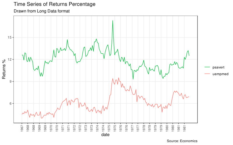
长数据形式就是说主要的数据只有两列,一列表示变量名,另一列是值。下面的例子我们用上面的 economics 长数据形式 economics_long,当然因为还有一个时间序列用来做 X 轴,所以这个数据是三列。
 1
 2
 3
 4
 5
 6
 7
 8
 9
10
11
12
13
14
15
16
17
18
19
20
21
22
23
24
25
26
27
28
29
30
31
32
33
34
35
36
37
38
39
40
41
42
43
44
45
46
47
48
49
|
library("ggplot2")
library("lubridate")
theme_set(theme_bw())

data(economics_long, package = "ggplot2")
head(economics_long)
# # A tibble: 6 x 4
#   date       variable value  value01
#   <date>     <chr>    <dbl>    <dbl>
# 1 1967-07-01 pce       507. 0
# 2 1967-08-01 pce       510. 0.000265
# 3 1967-09-01 pce       516. 0.000762
# 4 1967-10-01 pce       512. 0.000471
# 5 1967-11-01 pce       517. 0.000916
# 6 1967-12-01 pce       525. 0.00157

df <-
    economics_long[economics_long$variable %in% c("psavert", "uempmed"),]
df <- df[lubridate::year(df$date) %in% c(1967:1981),]

# labels and breaks for X axis text
brks <- df$date[seq(1, length(df$date), 12)]
lbls <- lubridate::year(brks)

# plot
ggplot(df, aes(x = date)) +
    geom_line(aes(y = value, col = variable)) +
    labs(
        title = "Time Series of Returns Percentage",
        subtitle = "Drawn from Long Data format",
        caption = "Source: Economics",
        y = "Returns %",
        color = NULL
    ) +  # title and caption
    # change to monthly ticks and labels
    scale_x_date(labels = lbls, breaks = brks) +
    scale_color_manual(
        labels = c("psavert", "uempmed"),
        values = c("psavert" = "#00ba38", "uempmed" = "#f8766d")
    ) +  # line color
    theme(
        axis.text.x = element_text(
            angle = 90,
            vjust = 0.5,
            size = 8
        ),
        # rotate x axis text
        panel.grid.minor = element_blank()
    )  # turn off minor grid
|
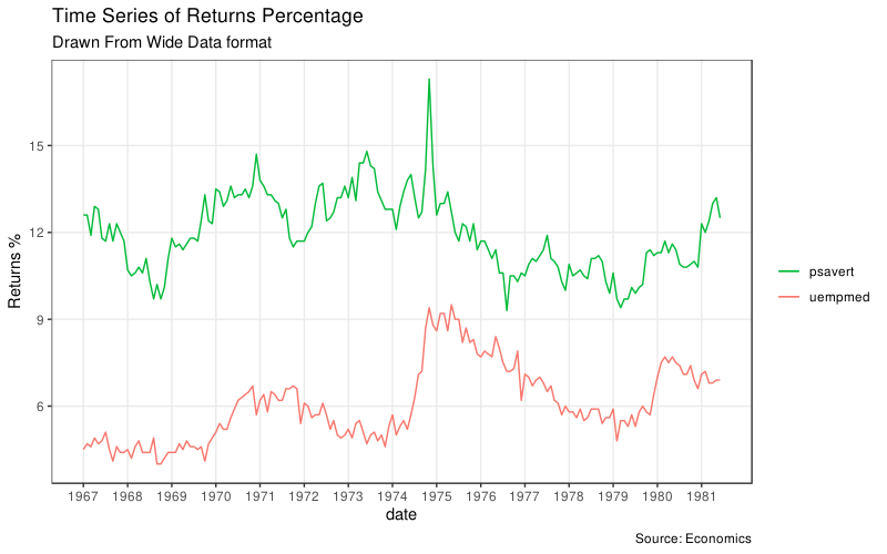
前面提到过,作图的时候只要依据一列数据通过 geom 改变了图的几何特性(点的形状/大小/颜色,线的粗细/类型/颜色等等),ggplot 都会自动生成一个对应的图例。
但是当我们是用时间序列组图的时候是自己一次一次的调用 geom_line() 一条一条画线,所以这时候并没有自动生成图例。偏偏这时候一般确实又是需要有图例给不同的线做解释的。这时候就可以用 scale_aesthetic_manual() 这些函数来自己加上图例(比如如果只改了线的颜色那就可以用 scale_color_manual())。这时候还可以通过分别通过 name 和 values 参数指定图例的标题和和作图的颜色。
下面我们会作出一张和刚刚上面长数据出来的一模一样的图,但是看代码就知道事实上所用的方法确是完全不一样的。在长数据作图中虽然也用到了 scale_color_manual(),但是在那里这个函数仅仅是为了改变线条颜色而已,不用这个函数上面的图也会有图例生成,只是图会使用 ggplot 的默认颜色而已。但是在这里的例子里如果不使用 scale_color_manual() 的话图根本不会有图例生成。(事实上我自己试了这里即使注释掉 scale_color_manual() 函数出来的图还是有图例的,只是线条颜色确实会变成 ggplot 默认颜色而已而且图例标题不会去掉而已,我猜这可能是 ggplot 在更新过程中加入了这一功能)
 1
 2
 3
 4
 5
 6
 7
 8
 9
10
11
12
13
14
15
16
17
18
19
20
21
22
23
24
25
|
library("ggplot2")
library("lubridate")
theme_set(theme_bw())

df <- economics[, c("date", "psavert", "uempmed")]
df <- df[lubridate::year(df$date) %in% c(1967:1981),]

# labels and breaks for X axis text
brks <- df$date[seq(1, length(df$date), 12)]
lbls <- lubridate::year(brks)

# plot
ggplot(df, aes(x = date)) +
    geom_line(aes(y = psavert, col = "psavert")) +
    geom_line(aes(y = uempmed, col = "uempmed")) +
    labs(
        title = "Time Series of Returns Percentage",
        subtitle = "Drawn From Wide Data format",
        caption = "Source: Economics",
        y = "Returns %"
    ) +  # title and caption
    scale_x_date(labels = lbls, breaks = brks) +  # change to monthly ticks and labels
    scale_color_manual(name = "",
                       values = c("psavert" = "#00ba38", "uempmed" = "#f8766d")) +  # line color
    theme(panel.grid.minor = element_blank())  # turn off minor grid
|
Stacked Area Chart
略。
Calendar Heatmap
略。
Slope Chart
坡度图很适合用于展示数值的变化情况以及不同类别的排序。当时间序列数据但是时间点很少的时候也很适合用坡度图。
  1
  2
  3
  4
  5
  6
  7
  8
  9
 10
 11
 12
 13
 14
 15
 16
 17
 18
 19
 20
 21
 22
 23
 24
 25
 26
 27
 28
 29
 30
 31
 32
 33
 34
 35
 36
 37
 38
 39
 40
 41
 42
 43
 44
 45
 46
 47
 48
 49
 50
 51
 52
 53
 54
 55
 56
 57
 58
 59
 60
 61
 62
 63
 64
 65
 66
 67
 68
 69
 70
 71
 72
 73
 74
 75
 76
 77
 78
 79
 80
 81
 82
 83
 84
 85
 86
 87
 88
 89
 90
 91
 92
 93
 94
 95
 96
 97
 98
 99
100
101
102
103
104
105
106
107
108
109
110
111
112
113
114
115
116
|
library("dplyr")
theme_set(theme_classic())

url <- textConnection(RCurl::getURL("https://raw.githubusercontent.com/jkeirstead/r-slopegraph/master/cancer_survival_rates.csv"))
source_df <- read.csv(url)
head(source_df)
#                               group year value
# 1                       Oral cavity    5  56.7
# 2                        Oesophagus    5  14.2
# 3                           Stomach    5  23.8
# 4                             Colon    5  61.7
# 5                            Rectum    5  62.6
# 6  Liver and intrahepatic bile duct    5   7.5
# 7                          Pancreas    5   4.0
# 8                            Larynx    5  68.8
# 9                 Lung and bronchus    5  15.0
# 10                        Melanomas    5  89.0

# Define functions. Source: https://github.com/jkeirstead/r-slopegraph
tufte_sort <-
    function(df,
             x = "year",
             y = "value",
             group = "group",
             method = "tufte",
             min.space = 0.05) {
        ## First rename the columns for consistency
        ids <- match(c(x, y, group), names(df))
        df <- df[, ids]
        names(df) <- c("x", "y", "group")

        ## Expand grid to ensure every combination has a defined value
        tmp <- expand.grid(x = unique(df$x), group = unique(df$group))
        tmp <- merge(df, tmp, all.y = TRUE)
        df <- dplyr::mutate(tmp, y = ifelse(is.na(y), 0, y))

        ## Cast into a matrix shape and arrange by first column
        require("reshape2")
        tmp <- reshape2::dcast(df, group ~ x, value.var = "y")
        ord <- order(tmp[, 2])
        tmp <- tmp[ord, ]

        min.space <- min.space * diff(range(tmp[, -1]))
        yshift <- numeric(nrow(tmp))
        ## Start at "bottom" row
        ## Repeat for rest of the rows until you hit the top
        for (i in 2:nrow(tmp)) {
            ## Shift subsequent row up by equal space so gap between
            ## two entries is >= minimum
            mat <- as.matrix(tmp[(i - 1):i, -1])
            d.min <- min(diff(mat))
            yshift[i] <- ifelse(d.min < min.space, min.space - d.min, 0)
        }


        tmp <- cbind(tmp, yshift = cumsum(yshift))

        scale <- 1
        tmp <-
            reshape2::melt(
                tmp,
                id = c("group", "yshift"),
                variable.name = "x",
                value.name = "y"
            )
        ## Store these gaps in a separate variable so that they can be scaled ypos = a*yshift + y

        tmp <- transform(tmp, ypos = y + scale * yshift)
        return(tmp)

    }

plot_slopegraph <- function(df) {
    ylabs <- subset(df, x == head(x, 1))$group
    yvals <- subset(df, x == head(x, 1))$ypos
    fontSize <- 3
    gg <- ggplot(df, aes(x = x, y = ypos)) +
        geom_line(aes(group = group), colour = "grey80") +
        geom_point(colour = "white", size = 8) +
        geom_text(aes(label = y), size = fontSize, family = "American Typewriter") +
        scale_y_continuous(name = "",
                           breaks = yvals,
                           labels = ylabs)
    return(gg)
}

## Prepare data
df <- tufte_sort(
    source_df,
    x = "year",
    y = "value",
    group = "group",
    method = "tufte",
    min.space = 0.05
)

df <- transform(df,
                x = factor(
                    x,
                    levels = c(5, 10, 15, 20),
                    labels = c("5 years", "10 years", "15 years", "20 years")
                ),
                y = round(y))

## Plot
plot_slopegraph(df) + labs(title = "Estimates of % survival rates") +
    theme(
        axis.title = element_blank(),
        axis.ticks = element_blank(),
        plot.title = element_text(
            hjust = 0.5,
            family = "American Typewriter",
            face = "bold"
        ),
        axis.text = element_text(family = "American Typewriter",
                                 face = "bold"))
|
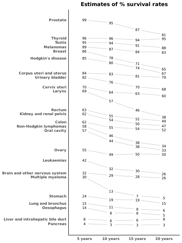
说实话,这个函数过于复杂,我已经放弃读代码了。这个代码如注释里写的,其实是参考 jkeirstead/r-slopegraph 写的。但是我也找到一个 R 包 leeper/slopegraph,这个包就已经包装得很好了,可以直接安装使用。
Seasonal Plot
涉及到时间序列对象 ts 或者 xts 的时候,forecast::ggseasonplot 可以可视化数据的季节性变化情况。下面的例子分别用了自带的时间序列 AirPassengers 和 nottem 作图:
 1
 2
 3
 4
 5
 6
 7
 8
 9
10
11
12
13
14
|
library("ggplot2")
library("forecast")
theme_set(theme_classic())

# Subset data for a smaller timewindow
nottem_small <- window(nottem,
                       start = c(1920, 1),
                       end = c(1925, 12))

# Plot
ggseasonplot(AirPassengers) +
    labs(title = "Seasonal plot: International Airline Passengers")
ggseasonplot(nottem_small) +
    labs(title = "Seasonal plot: Air temperatures at Nottingham Castle")
|
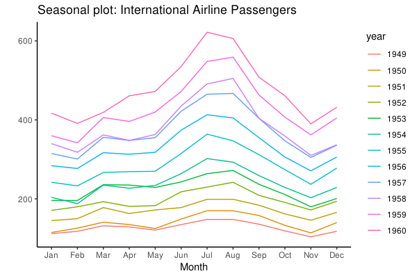
可以看到飞机乘客数是逐年上涨并且是有季节性的模式的。
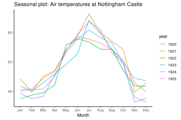
而这里天气温度虽然没有逐年上涨,但是明显是有相同的季节性变化模式的。
后面的第 7 节 Groups 里的 Hierarchical Dendrogram 图和 Cluster 都比较简单,我用的不多,略。第 8 节是 Spatial 涉及地图作图,我完全用不上,略。
用的代码:ggplot2.R
文章作者
Jackie
上次更新
2019-08-26
(c4557a2)