ggplot2 学习 第二部分:外观自定义
翻译整理自:The Complete ggplot2 Tutorial - Part 2 | How To Customize ggplot2 (Full R code) 。
这一篇将会介绍如何自定义一个 ggplot 图的 6 个主要部分,是一份涵盖了大部分图形自定义需求的的详细的讲义了。
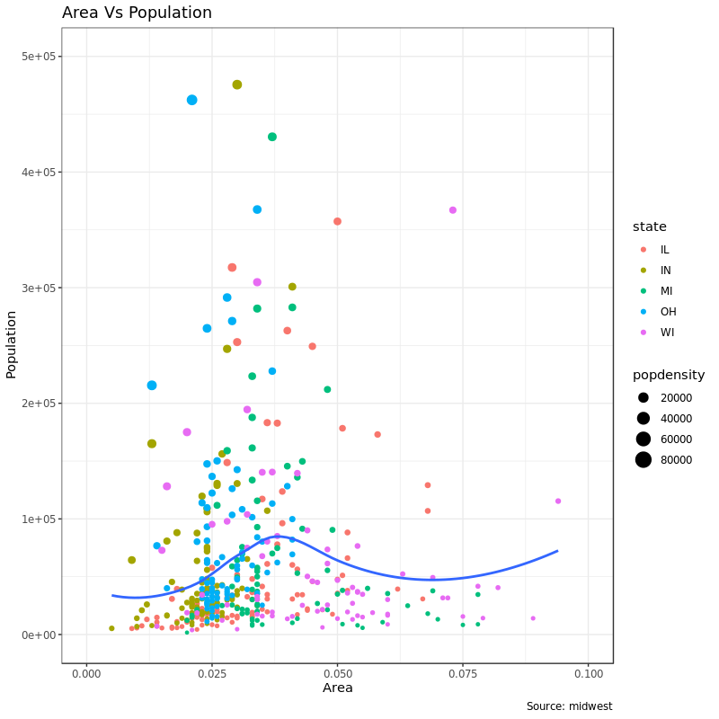
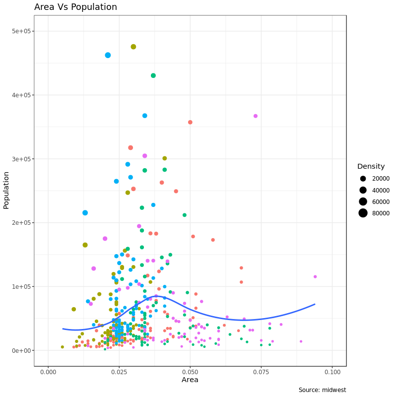
我们首先还是用第一篇里 midwest 数据地区面积 area 和人口 population 这个散点图例子,但是我们还用了 state 数据来作为点的颜色,popdensity 作为点的大小:
 1
 2
 3
 4
 5
 6
 7
 8
 9
10
11
12
13
|
library(ggplot2)
data("midwest", package = "ggplot2")
theme_set(theme_bw())

gg <- ggplot(midwest, aes(x = area, y = poptotal)) +
    geom_point(aes(col = state, size = popdensity)) +
    geom_smooth(method = "loess", se = F) + xlim(c(0, 0.1)) + ylim(c(0, 500000)) +
    labs(title = "Area Vs Population",
        y = "Population",
        x = "Area",
        caption = "Source: midwest")

plot(gg)
|
这个图具有一张图所需要的全部元素,比如标题、轴标签、图例等等,都已经默认设置得很 nice 了。但是如果我还想改呢?
大部分改图的外观的要求都可以用 theme 来实现,这个函数可以接受的参数非常多,可以用 ?theme 进帮助看一下。通过 theme() 设定图形元素需要用到 element_type(),主要分 4 种:
element_text:标题、副标题、说明等等这些文本性的元素element_line:类似的,坐标轴线、网格线等这些元素就要用element_line来设置element_rect:修改矩形元素,比如图和面板的背景element_blank:撤销主题设定的元素
下面会对这些内容进行详细讲解。
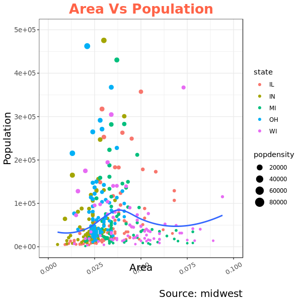
1. 添加图标题和坐标轴轴标题
图和坐标轴的标题、坐标轴标签这些都是整个图的主题一部分,所以可以用 theme() 来设置。上面也说过,theme() 通过接受 element_type() ,而我们现在要改的都是文本性的东西,所以就用 element_text 。
我们下面的例子改了文本大小、颜色、字体样式和行高。同时还用 angle 参数把坐标轴标签文字旋转了:
 1
 2
 3
 4
 5
 6
 7
 8
 9
10
11
12
13
14
15
16
17
|
gg <- ggplot(midwest, aes(x = area, y = poptotal)) +
    geom_point(aes(col = state, size = popdensity)) +
    geom_smooth(method = "loess", se = F) +
    xlim(c(0, 0.1)) + ylim(c(0, 500000)) +
    labs(title = "Area Vs Population", y = "Population", x = "Area",
         caption = "Source: midwest")

gg + theme(
    plot.title = element_text(
        size = 20, face = "bold", family = "Comic Sans MS",
        color = "tomato", hjust = 0.5, lineheight = 1.2), # title
    plot.subtitle = element_text(size = 15, face = "bold", hjust = 0.5), # subtitle
    plot.caption = element_text(size = 15, family = "serif"), # caption
    axis.title.x = element_text(vjust = 10, size = 15), # X axis title
    axis.title.y = element_text(size = 15), # Y axis title
    axis.text.x = element_text(size = 10, angle = 30, vjust = .5), # X axis text
    axis.text.y = element_text(size = 10))  # Y axis text
|
2. 图例修改
当使用 aes() 根据一列数据来改变 geom 图形(点、线或者条形)的映射情况(比如 fill,size,col, shape 和 stroke)的时候,比如上面的 geom_point(aes(col = state, size = popdensity))里,ggplot 就会根据映射情况自动生成图例(legend)。
但如果我们用的 geom 类型是静态的话(这里应该指的图形不根据数据的某一列来设置的时候),ggplot 不会自动生成图例。这时候我们需要自己构造图例。下面的例子我们都是针对自动生成的图例而言。
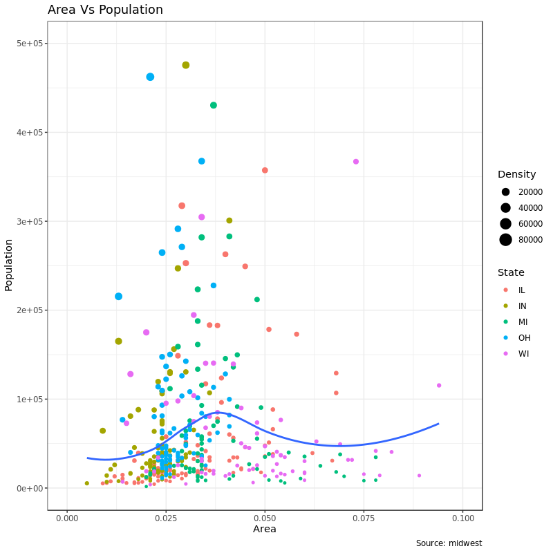
2.1 改变图例的标题
以上面的图为例,我们有两个图例,分别是针对 color 和 size。size 对应着一个连续变量(popdensity) 而 color 对应一个分类变量(state)。
改变 legend 的 title 有 3 种办法:
1. labs():
 1
 2
 3
 4
 5
 6
 7
 8
 9
10
11
|
# Base Plot
gg <- ggplot(midwest, aes(x = area, y = poptotal)) +
geom_point(aes(col = state, size = popdensity)) +
geom_smooth(method = "loess", se = F) + xlim(c(0, 0.1)) + ylim(c(0, 500000)) +
labs(
title = "Area Vs Population",
y = "Population",
x = "Area",
caption = "Source: midwest")
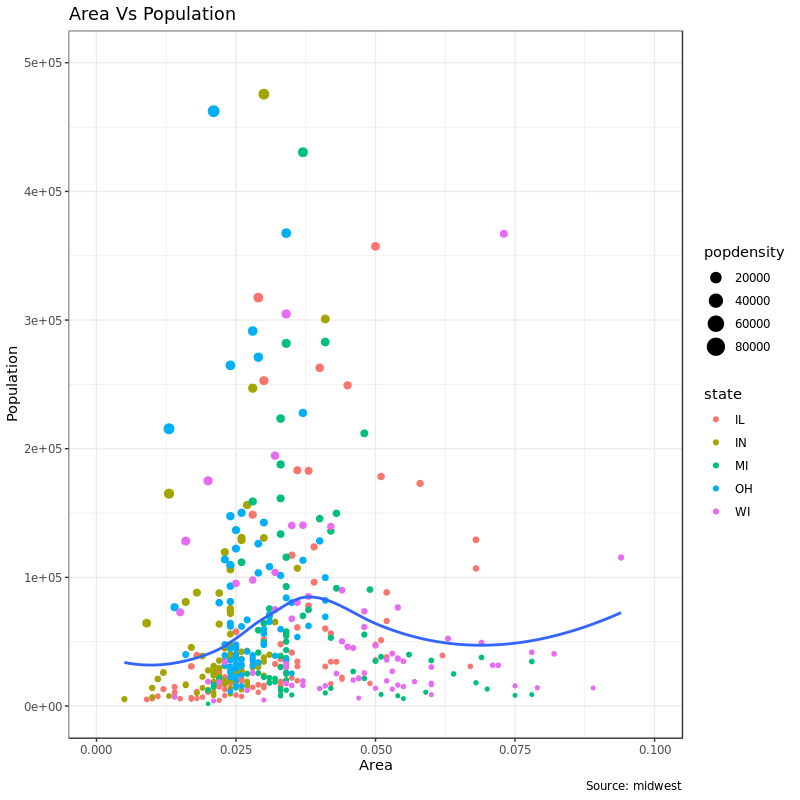
gg + labs(color = "State", size = "Density") # modify legend title
|
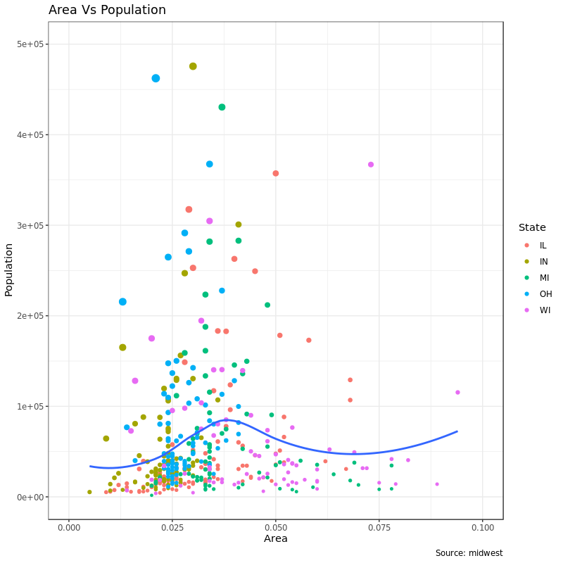
2. guilds():
 1
 2
 3
 4
 5
 6
 7
 8
 9
10
11
12
|
# Base Plot
gg <- ggplot(midwest, aes(x = area, y = poptotal)) +
    geom_point(aes(col = state, size = popdensity)) +
    geom_smooth(method = "loess", se = F) + xlim(c(0, 0.1)) + ylim(c(0, 500000)) +
    labs(
        title = "Area Vs Population",
        y = "Population",
        x = "Area",
        caption = "Source: midwest")
gg <- gg + guides(color = guide_legend("State"), size = guide_legend("Density"))  # modify legend title

plot(gg)
|
图同上。
3. scale_aesthetic_vartype():
scale_aesthetic_vartype() 允许我们单独为某一个映射去掉 legend 而不改变其他的,只需要为这个 legend 单独加上 guild = FALSE 就行。还是上面那个例子,如果我们想把 size 这个图例去掉,得用 scale_size_continuous():
 1
 2
 3
 4
 5
 6
 7
 8
 9
10
11
12
13
|
# Base Plot
gg <- ggplot(midwest, aes(x = area, y = poptotal)) +
    geom_point(aes(col = state, size = popdensity)) +
    geom_smooth(method = "loess", se = F) + xlim(c(0, 0.1)) + ylim(c(0, 500000)) +
    labs(
        title = "Area Vs Population",
        y = "Population",
        x = "Area",
        caption = "Source: midwest")

# Modify Legend
gg + scale_color_discrete(name = "State") +
    scale_size_continuous(name = "Density", guide = FALSE)  # turn off legend for size
|
我们可以照葫芦画瓢把 color 的图例去掉:
 1
 2
 3
 4
 5
 6
 7
 8
 9
10
11
12
13
|
# Base Plot
gg <- ggplot(midwest, aes(x = area, y = poptotal)) +
    geom_point(aes(col = state, size = popdensity)) +
    geom_smooth(method = "loess", se = F) + xlim(c(0, 0.1)) + ylim(c(0, 500000)) +
    labs(
        title = "Area Vs Population",
        y = "Population",
        x = "Area",
        caption = "Source: midwest")

# Modify Legend
gg + scale_color_discrete(name = "State", guide = FALSE) +   # turn off legend for color
    scale_size_continuous(name = "Density")
|
2.2 类别变量图例的标签和点的颜色
我们可以用scale_aesthetic_manual() 来改变这些元素。新的图例标签需要用一个字符串类型的 vector 通过 labels 参数来传递。要改颜色的话,要通过 values 参数来传递。比如:
 1
 2
 3
 4
 5
 6
 7
 8
 9
10
11
12
13
14
15
16
17
18
19
20
21
22
23
|
# Base Plot
gg <- ggplot(midwest, aes(x = area, y = poptotal)) +
geom_point(aes(col = state, size = popdensity)) +
geom_smooth(method = "loess", se = F) + xlim(c(0, 0.1)) + ylim(c(0, 500000)) +
labs(
title = "Area Vs Population",
y = "Population",
x = "Area",
caption = "Source: midwest")
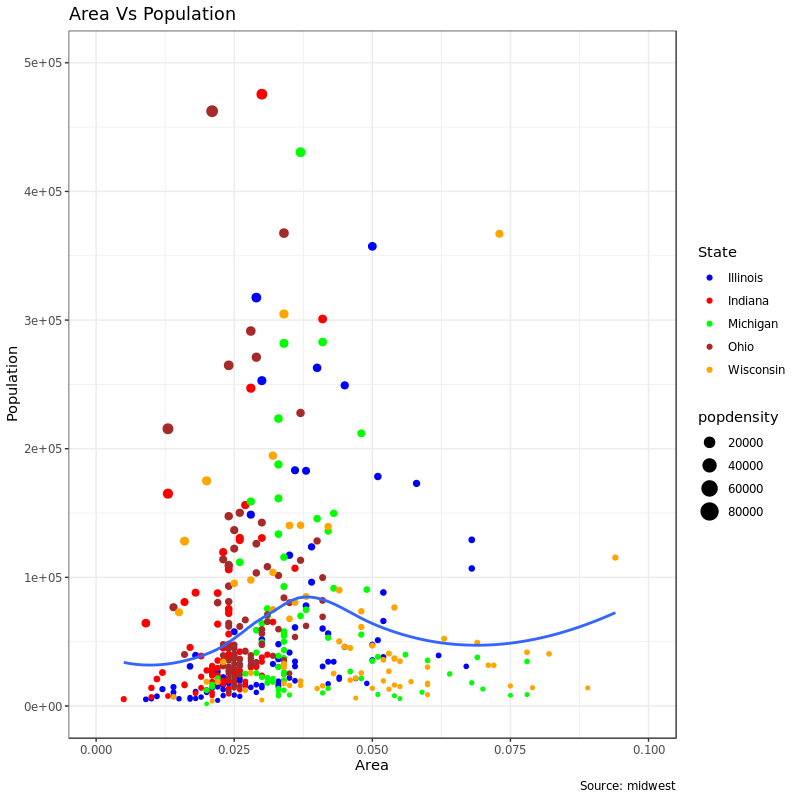
gg + scale_color_manual(
name = "State",
labels = c("Illinois",
"Indiana",
"Michigan",
"Ohio",
"Wisconsin"),
values = c(
"IL" = "blue",
"IN" = "red",
"MI" = "green",
"OH" = "brown",
"WI" = "orange"))
|
2.3 改变图例的顺序
上图如果我们想在图例里先显示 size 的图例(popdensity) 然后再显示 color 的图例(state),需要用到 guilds() 的 order 参数:
 1
 2
 3
 4
 5
 6
 7
 8
 9
10
11
12
|
# Base Plot
gg <- ggplot(midwest, aes(x = area, y = poptotal)) +
    geom_point(aes(col = state, size = popdensity)) +
    geom_smooth(method = "loess", se = F) + xlim(c(0, 0.1)) + ylim(c(0, 500000)) +
    labs(
        title = "Area Vs Population",
        y = "Population",
        x = "Area",
        caption = "Source: midwest")

gg + guides(colour = guide_legend(order = 2),
            size = guide_legend(order = 1))
|
如果还想改变图例内部元素的顺序(比如 state 图例里各个州的顺序),可以通过上面的例子里的 values 和 labels按想要的顺序来传递参数。
2.4 改变图例标题、文字和背景的样式
图例的背景是个图形元素,所以得用 element_rect() 来改:
 1
 2
 3
 4
 5
 6
 7
 8
 9
10
11
12
13
|
# Base Plot
gg <- ggplot(midwest, aes(x = area, y = poptotal)) +
    geom_point(aes(col = state, size = popdensity)) +
    geom_smooth(method = "loess", se = F) + xlim(c(0, 0.1)) + ylim(c(0, 500000)) +
    labs(title = "Area Vs Population",
        y = "Population",
        x = "Area",
        caption = "Source: midwest")

gg + theme(legend.title = element_text(size = 12, color = "firebrick"),
    legend.text = element_text(size = 10),
    legend.key = element_rect(fill = 'springgreen')) +
    guides(colour = guide_legend(override.aes = list(size = 2, stroke =1.5)))
|
 ###
###
2.5 改变图例位置或去掉图例
图例在图里的位置属于主题的一部分,所以得通过 theme() 来改。如果想要把图例放在图的内部,可以使用 legend.justification来设置对齐。legend.position 可以通过 X/Y 轴座标来设置图例位置,比如 (0, 0) 是图的左下角,(1, 1) 是右上角。
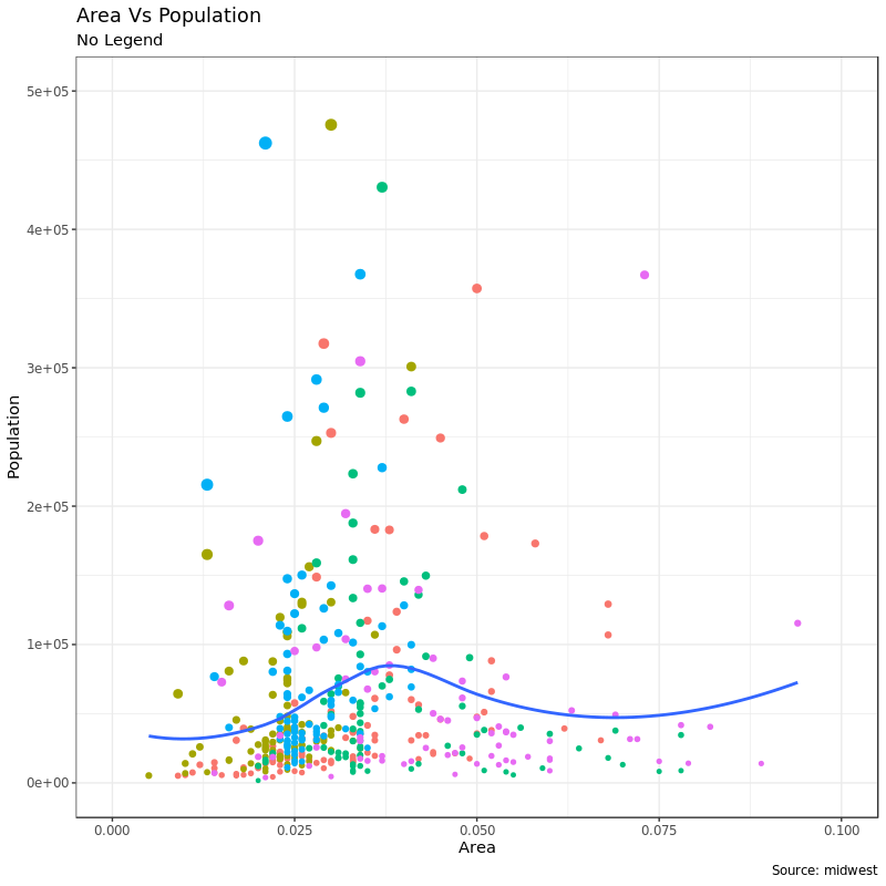
先看一个去掉图例:
 1
 2
 3
 4
 5
 6
 7
 8
 9
10
11
12
|
# Base Plot
gg <- ggplot(midwest, aes(x = area, y = poptotal)) +
    geom_point(aes(col = state, size = popdensity)) +
    geom_smooth(method = "loess", se = F) + xlim(c(0, 0.1)) + ylim(c(0, 500000)) +
    labs(title = "Area Vs Population",
        y = "Population",
        x = "Area",
        caption = "Source: midwest")

# No legend --------------------------------------------------
gg + theme(legend.position = "None") +
    labs(subtitle = "No Legend")
|
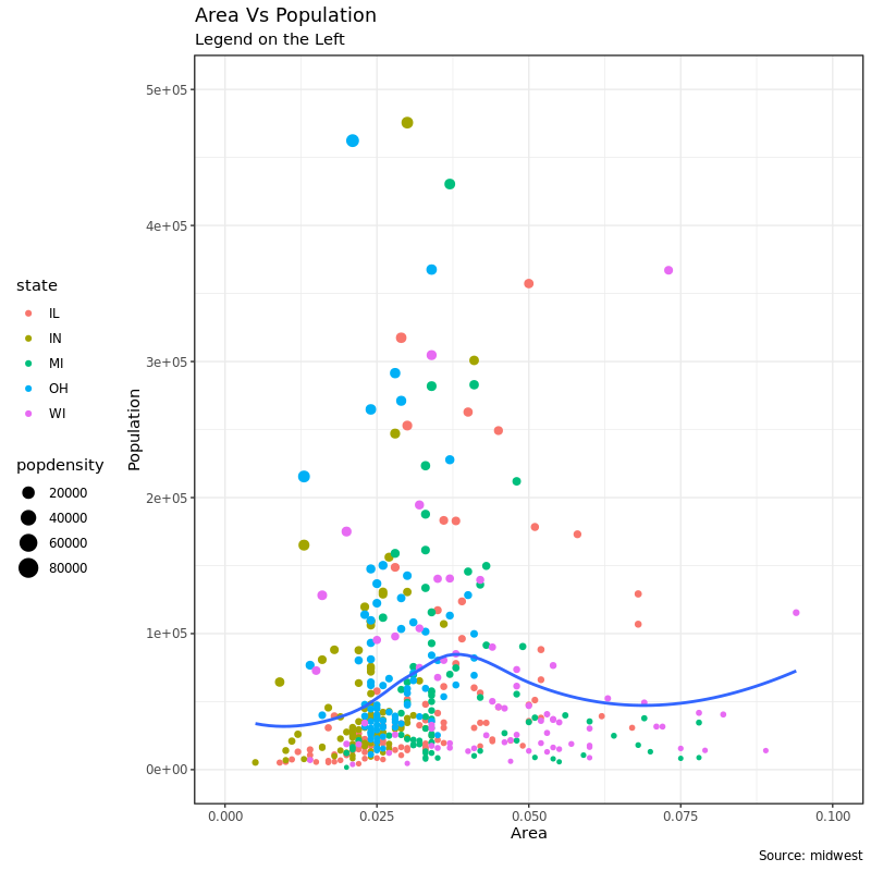
图例在左边:
1
2
|
gg + theme(legend.position = "left") +
    labs(subtitle = "Legend on the Left")
|
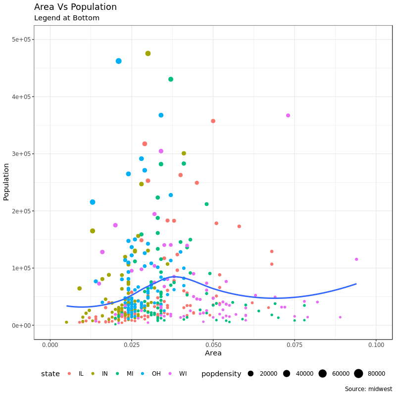
图例在下面横放:
1
2
3
|
# legend at the bottom and horizontal
gg + theme(legend.position = "bottom", legend.box = "horizontal") +
    labs(subtitle = "Legend at Bottom")
|
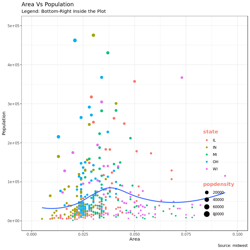
图例在图的内部、右下方:
1
2
3
4
5
6
7
|
# legend at bottom-right, inside the plot
gg + theme(legend.title = element_text(size = 12, color = "salmon", face = "bold"),
    legend.justification = c(1, 0),
    legend.position = c(0.95, 0.05),
    legend.background = element_blank(),
    legend.key = element_blank()) +
    labs(subtitle = "Legend: Bottom-Right Inside the Plot")
|
或者图例在图内部、左上方:
1
2
3
4
5
6
7
|
# legend at top-left, inside the plot
gg + theme(legend.title = element_text(size = 12, color = "salmon", face = "bold"),
    legend.justification = c(0, 1),
    legend.position = c(0.05, 0.95),
    legend.background = element_blank(),
    legend.key = element_blank()) +
    labs(subtitle = "Legend: Top-Left Inside the Plot")
|
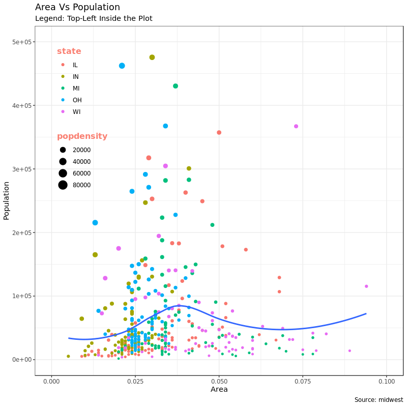
结合这几张图来理解 legend.position 和 legend.justification 的关系:legend.position 设置位置的时候,特别是用坐标来设置对齐的位置的时候,legend.justification 用来控制图例在对齐的时候以图例的哪里作为对齐点。举个例子,上面 legend.position = c(0.05, 0.95) 虽然已经设置了图例在相对坐标 c(0.05, 0.95) 的位置,但是我们图例是一个很大的矩形,那矩形的哪里去对齐这个 c(0.05, 0.95) 呢?这个就要用 legend.justification 来设置了。上面的例子里,legend.justification = c(0, 1) 就是说用矩形图例的左上角去对齐。
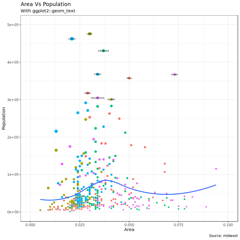
3. 添加文字、标识和注释
3.1 给点加上文字和标识
在上面的图中,想给 population 很大的点(比如大于 300K 的点)加上它的标签,这时候就要用到 text 或者 label。为了不给所有的点加上文字或者标志,我们需要首先单独把我们想加标签的数据找出来:
1
2
3
4
|
library("tidyverse")
midwest_sub <- midwest %>%
    dplyr::filter(poptotal > 300000) %>%
    dplyr::mutate(large_county = dplyr::if_else(.$poptotal > 300000, .$county, ""))
|
在我们新建的 midwest_sub 数据里,新生成了一个 large_contry 变量,这个变量在满足 poptotal > 300000 时取值为 county,不满足该条件时取空值。所以我们根据这一列数据给点图加标志的时候就可以实现只给满足条件的点加标志了:
 1
 2
 3
 4
 5
 6
 7
 8
 9
10
11
12
13
14
|
# Base Plot
gg <- ggplot(midwest, aes(x=area, y=poptotal)) +
    geom_point(aes(col=state, size=popdensity)) +
    geom_smooth(method="loess", se=F) + xlim(c(0, 0.1)) + ylim(c(0, 500000)) +
    labs(title="Area Vs Population", y="Population", x="Area", caption="Source: midwest")

# Plot text and label
gg + geom_text(aes(label = large_county), size = 2, data = midwest_sub) +
    labs(subtitle = "With ggplot2::geom_text") +
    theme(legend.position = "None")   # text

gg + geom_label(aes(label = large_county), size = 2, data = midwest_sub,alpha = 0.25) +
    labs(subtitle = "With ggplot2::geom_label") +
    theme(legend.position = "None")  # label
|
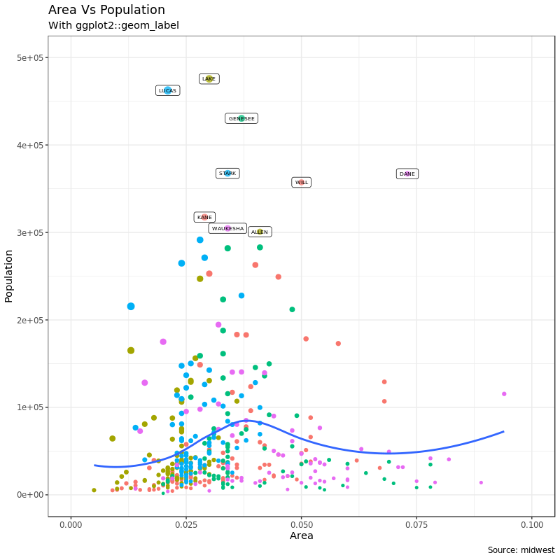
上面的图我们加的文字和标签都有一点和点重复,解决这个问题得用另外一个包 ggrepel:
1
2
3
4
5
6
7
8
9
|
# Plot text and label that REPELS eachother (using ggrepel pkg)
library("ggrepel")
gg + geom_text_repel(aes(label = large_county), size = 2, data = midwest_sub) +
    labs(subtitle = "With ggrepel::geom_text_repel") +
    theme(legend.position = "None")   # text

gg + geom_label_repel(aes(label = large_county), size = 2, data = midwest_sub) +
    labs(subtitle = "With ggrepel::geom_label_repel") +
    theme(legend.position = "None")   # label
|
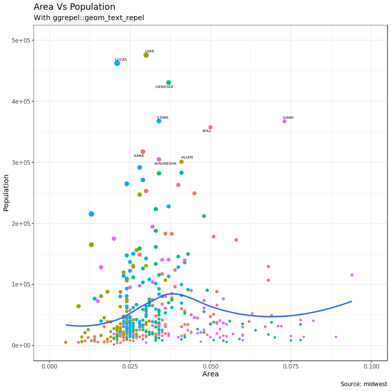
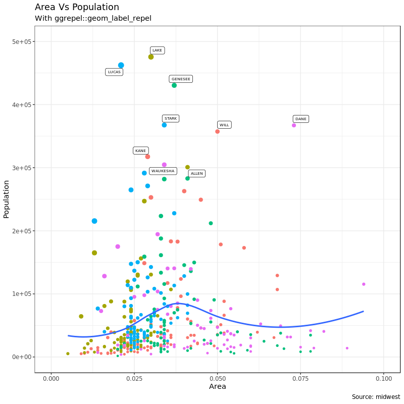
注意在上面画图的命令里,由于我们给点加的文字和标志的在另一个数据里,所以每次命令在给 gg 加 geom_xxx 的时候都需要用 data = midwest_sub 再次指定新数据。
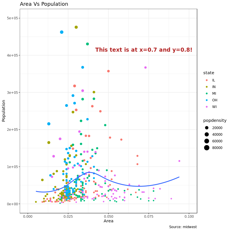
3.2 在图的任意位置加注释文字
annotation_custom() 可以在图的任意位置添加注释文字,annotation_custom() 需要一个 grob 对象来传递参数,这个要用 grid 包:
1
2
3
4
5
6
|
# Define and add annotation
library(grid)
my_text <- "This text is at x=0.7 and y=0.8!"
my_grob = grid.text(my_text, x=0.7,  y=0.8,
                    gp=gpar(col="firebrick", fontsize=14, fontface="bold"))
gg + annotation_custom(my_grob)
|
至于 grob 对象是什么,?grob 说
Creating grid graphical objects, short (“grob”s).
grob() and gTree() are the basic creators, grobTree() and gList() take several grobs to build a new one.
行吧…
4. 翻转和反转坐标轴
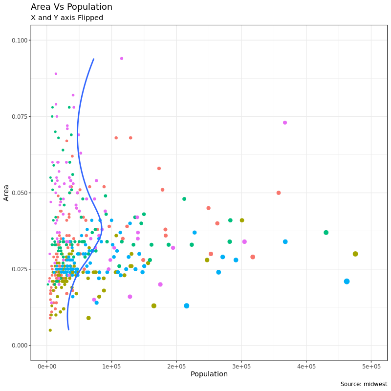
翻转,就是 X/Y 轴交换一个位置;反转,坐标轴方向反过来。
4.1 翻转坐标轴
首先是翻转坐标轴,X 轴到原来 Y 轴的位置,Y 轴到原来 X 轴的位置:
 1
 2
 3
 4
 5
 6
 7
 8
 9
10
11
12
13
|
# Base Plot
gg <- ggplot(midwest, aes(x = area, y = poptotal)) +
    geom_point(aes(col = state, size = popdensity)) +
    geom_smooth(method = "loess", se = F) +
    xlim(c(0, 0.1)) + ylim(c(0, 500000)) +
    labs(title = "Area Vs Population",
        y = "Population",
        x = "Area",
        caption = "Source: midwest",
        subtitle = "X and Y axis Flipped") +
    theme(legend.position = "None")
# Flip the X and Y axis
gg + coord_flip()
|
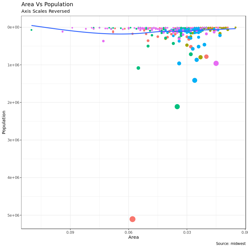
4.2 反转坐标轴
这个很简单,分别用 scale_x_reverse() 或者 scale_y_reverse() 就能反转 X/Y 轴了:
 1
 2
 3
 4
 5
 6
 7
 8
 9
10
11
12
13
14
|
# Base Plot
gg <- ggplot(midwest, aes(x = area, y = poptotal)) +
    geom_point(aes(col = state, size = popdensity)) +
    geom_smooth(method = "loess", se = F) +
    xlim(c(0, 0.1)) + ylim(c(0, 500000)) +
    labs(title = "Area Vs Population",
        y = "Population",
        x = "Area",
        caption = "Source: midwest",
        subtitle = "Axis Scales Reversed") +
    theme(legend.position = "None")

# Reverse the X and Y Axis
gg + scale_x_reverse() + scale_y_reverse()
|
5. 图形分面:一幅图片里画几张图
这次我们用另一个数据来举例子。mpg 也是 ggplot2 自带的数据集。
1
2
3
4
5
6
7
8
|
data(mpg, package = "ggplot2")  # load data

g <- ggplot(mpg, aes(x = displ, y = hwy)) +
    geom_point() +
    labs(title = "hwy vs displ", caption = "Source: mpg") +
    geom_smooth(method = "lm", se = FALSE) +
    theme_bw()  # apply bw theme
plot(g)
|
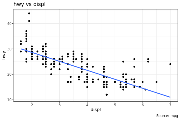
这里画出了汽车发动机排量 displ 和里程 hwy 的关系。但是如果我们想分开看不同车型class呢?
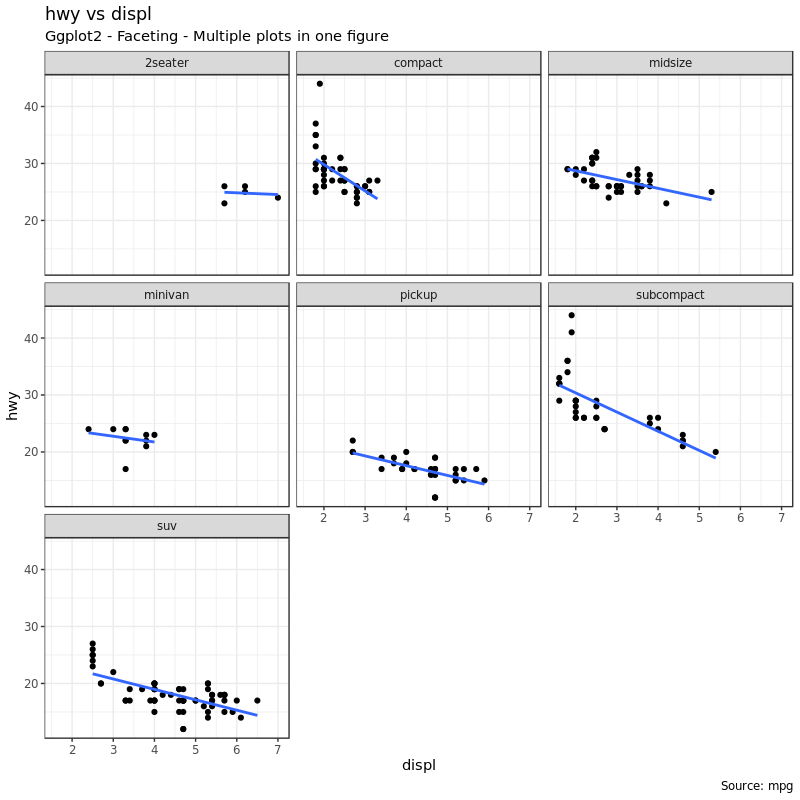
5.1 Facet Wrap
facet_wrap() 可以依据指定分类数据把一张图片拆分成多张小图。facet_wrap() 接受一个 formula 参数用来指定做图分面,~ 左右的元素分别作为做图的行和列:
 1
 2
 3
 4
 5
 6
 7
 8
 9
10
11
|
# Base Plot
g <- ggplot(mpg, aes(x = displ, y = hwy)) +
    geom_point() +
    geom_smooth(method = "lm", se = FALSE) +
    theme_bw()  # apply bw theme

# Facet wrap with common scales
g + facet_wrap(~ class, nrow = 3) +
    labs(title = "hwy vs displ",
    caption = "Source: mpg",
    subtitle = "Ggplot2 - Faceting - Multiple plots in one figure")  # Shared scales
|
1
2
3
4
5
|
# Facet wrap with free scales
g + facet_wrap(~ class, scales = "free") +
    labs(title = "hwy vs displ",
    caption = "Source: mpg",
    subtitle = "Ggplot2 - Faceting - Multiple plots in one figure with free scales")  # Scales free
|
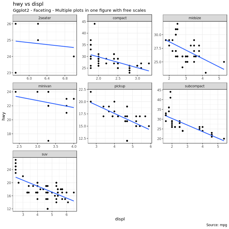
注意看第二张图 scales = "free" 参数使得每张小图不需要遵循同一个坐标尺度,这样点都可以集中在每幅小图的中央,而上面的图就会有点线不在图的中央。但是上图也有好处,遵循同一个坐标尺度可以让我们比较不同的图点和线的分布情况。
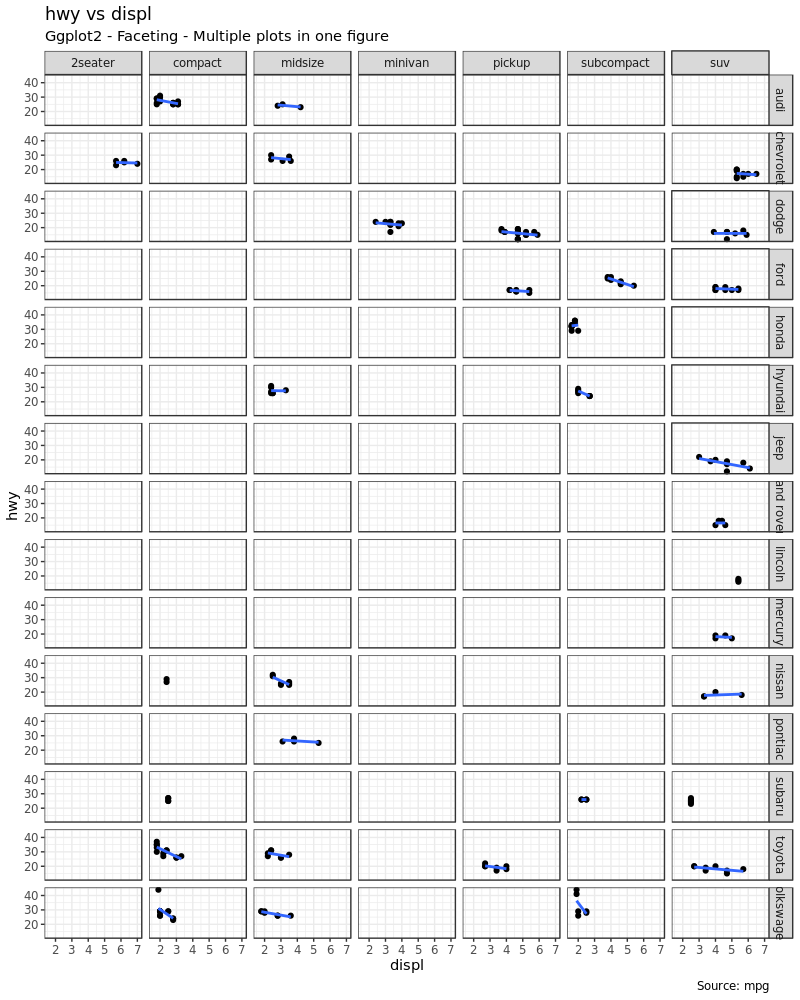
5.2 Facet Grid
上面的图有一个缺点就是各种标题、轴刻度标识之类的元素占据了图形中的很多空间,很大程度上压缩了做图空间。facet_grid 就会做出一张紧凑的图,唯一的不同是 facet_grid 不再允许我们定义做图时使用几行几列:
 1
 2
 3
 4
 5
 6
 7
 8
 9
10
11
12
|
# Base Plot
g <- ggplot(mpg, aes(x = displ, y = hwy)) +
    geom_point() +
    labs(title = "hwy vs displ",
         caption = "Source: mpg",
         subtitle = "Ggplot2 - Faceting - Multiple plots in one figure") +
    geom_smooth(method = "lm", se = FALSE) +
    theme_bw()  # apply bw theme

# Add Facet Grid
g1 <- g + facet_grid(manufacturer ~ class)  # manufacturer in rows and class in columns
plot(g1)
|
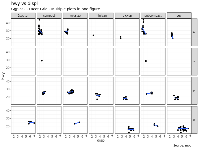
我们用 cyl 做行变量再画一张图:
 1
 2
 3
 4
 5
 6
 7
 8
 9
10
11
12
|
# Base Plot
g <- ggplot(mpg, aes(x = displ, y = hwy)) +
    geom_point() +
    geom_smooth(method = "lm", se = FALSE) +
    labs(title = "hwy vs displ",
         caption = "Source: mpg",
         subtitle = "Ggplot2 - Facet Grid - Multiple plots in one figure") +
    theme_bw()  # apply bw theme

# Add Facet Grid
g2 <- g + facet_grid(cyl ~ class)  # cyl in rows and class in columns.
plot(g2)
|
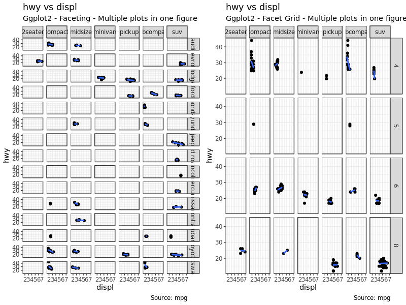
现在我们还可以把上面两幅图进一步组合在一起:
1
2
3
|
# Draw Multiple plots in same figure.
library("gridExtra")
gridExtra::grid.arrange(g1, g2, ncol=2)
|
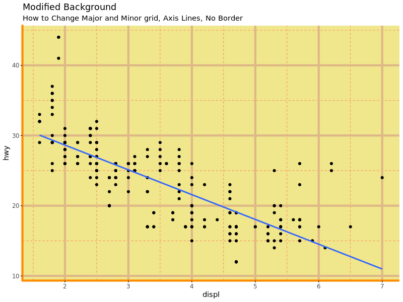
6. 修改图的背景、主次轴线
6.1 修改图的背景
直接上例子:
 1
 2
 3
 4
 5
 6
 7
 8
 9
10
11
12
13
14
15
16
17
|
g <- ggplot(mpg, aes(x = displ, y = hwy)) +
    geom_point() +
    geom_smooth(method = "lm", se = FALSE) +
    theme_bw()  # apply bw theme

# Change Plot Background elements
g + theme(
    panel.background = element_rect(fill = 'khaki'),
    panel.grid.major = element_line(colour = "burlywood", size = 1.5),
    panel.grid.minor = element_line(colour = "tomato", size = .25,
                                    linetype = "dashed"),
    panel.border = element_blank(),
    axis.line.x = element_line(colour = "darkorange", size = 1.5,
                               lineend = "butt"),
    axis.line.y = element_line(colour = "darkorange", size = 1.5)
    ) + labs(title = "Modified Background",
             subtitle = "How to Change Major and Minor grid, Axis Lines, No Border")
|
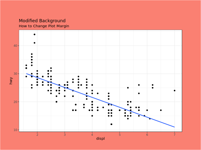
改变图的边距:
1
2
3
4
|
# Change Plot Margins
g + theme(plot.background = element_rect(fill = "salmon"),
          plot.margin = unit(c(2, 2, 1, 1), "cm")) +  # top, right, bottom, left
    labs(title = "Modified Background", subtitle = "How to Change Plot Margin")
|
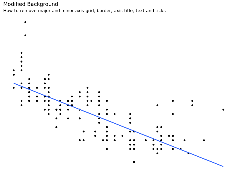
6.2 移除所有网格线、轴线、刻度、标签等等
 1
 2
 3
 4
 5
 6
 7
 8
 9
10
11
12
13
14
15
|
# Base Plot
g <- ggplot(mpg, aes(x = displ, y = hwy)) +
    geom_point() +
    geom_smooth(method = "lm", se = FALSE) +
    theme_bw()  # apply bw theme

g + theme(
    panel.grid.major = element_blank(),
    panel.grid.minor = element_blank(),
    panel.border = element_blank(),
    axis.title = element_blank(),
    axis.text = element_blank(),
    axis.ticks = element_blank()
) + labs(title = "Modified Background",
         subtitle = "How to remove major and minor axis grid, border, axis title, text and ticks")
|
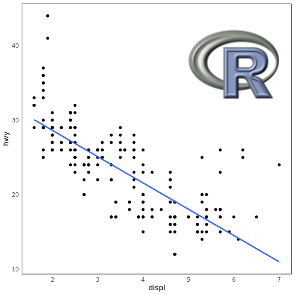
6.3 在背景里添加一张图片
 1
 2
 3
 4
 5
 6
 7
 8
 9
10
11
12
13
14
15
16
17
18
19
|
library("grid")
library("png")

img <- readPNG(system.file("img", "Rlogo.png", package="png"))
g_pic <- rasterGrob(img, interpolate = TRUE)

# Base Plot
g <- ggplot(mpg, aes(x = displ, y = hwy)) +
    geom_point() +
    geom_smooth(method = "lm", se = FALSE) +
    theme_bw()  # apply bw theme

g + theme(
    panel.grid.major = element_blank(),
    panel.grid.minor = element_blank(),
    plot.title = element_text(size = rel(1.5), face = "bold"),
    axis.ticks = element_blank()) +
    annotation_custom(g_pic, xmin = 5, xmax = 7,
                      ymin = 30, ymax = 45)
|
这一部分到这里就结束了,至此,ggplot2 做图的方方面面基本上都已经讲到了。第三部分也是最后一部分将会综合运用前两个部分学到的东西,通过更多的例子展示一些数据可视化。
code: ggplot2_2.R