翻译整理自:Top 50 ggplot2 Visualizations - The Master
List,有删改。
这是整个 ggplot2 系列的第三部分也是最后一部分。当然从标题知道这是上部,当然不是因为是最后一部分估计要吊人胃口分为上下(这么写应该看不出来是在讽刺《哈利波特与死亡圣器》吧),而是写着写着发现这一部分太长了….我开始写还在旧历 2018 年西历 1 月份,结果拖到 2019 年西历 3 月份了。然后发现文件太长太大也不方便管理,所以干脆分上下好了。下部分很多图我看了不是特别实用,所以等什么时候更新完全就是看心情了。
这部分将会结合一个个数据可视化的例子,运用前面学到的定义 ggplot2 图形的方方面面来做图。
1. Correlation
展示变量之间相关关系。
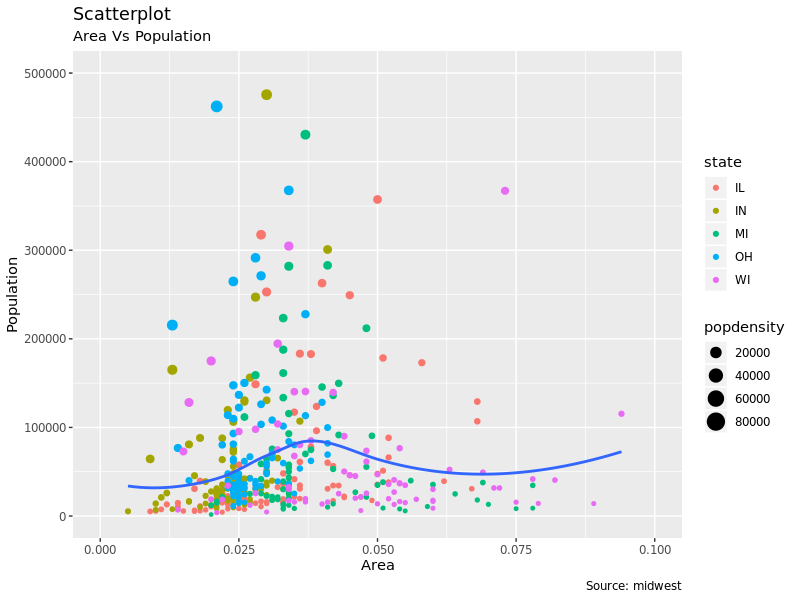
1.1 Scatterplot
要展示变量之间的相关性,散点图无疑是用的最多的。geom_point() 就是用来画点图的,geom_smooth
可以给点图添加拟合出的平滑的趋势线,默认情况下 method='lm' 添加直线。
1
2
3
4
|
options(scipen = 999)  # turn-off scientific notation like 1e+48
theme_set(theme_bw())  # pre-set the bw theme.
data("midwest", package = "ggplot2")
midwest
|
 1
 2
 3
 4
 5
 6
 7
 8
 9
10
11
12
13
14
15
16
17
18
19
20
|
## # A tibble: 437 x 28
##      PID county state  area poptotal popdensity popwhite popblack
##    <int> <chr>  <chr> <dbl>    <int>      <dbl>    <int>    <int>
##  1   561 ADAMS  IL    0.052    66090      1271.    63917     1702
##  2   562 ALEXA… IL    0.014    10626       759      7054     3496
##  3   563 BOND   IL    0.022    14991       681.    14477      429
##  4   564 BOONE  IL    0.017    30806      1812.    29344      127
##  5   565 BROWN  IL    0.018     5836       324.     5264      547
##  6   566 BUREAU IL    0.05     35688       714.    35157       50
##  7   567 CALHO… IL    0.017     5322       313.     5298        1
##  8   568 CARRO… IL    0.027    16805       622.    16519      111
##  9   569 CASS   IL    0.024    13437       560.    13384       16
## 10   570 CHAMP… IL    0.058   173025      2983.   146506    16559
## # … with 427 more rows, and 20 more variables: popamerindian <int>,
## #   popasian <int>, popother <int>, percwhite <dbl>, percblack <dbl>,
## #   percamerindan <dbl>, percasian <dbl>, percother <dbl>,
## #   popadults <int>, perchsd <dbl>, percollege <dbl>, percprof <dbl>,
## #   poppovertyknown <int>, percpovertyknown <dbl>, percbelowpoverty <dbl>,
## #   percchildbelowpovert <dbl>, percadultpoverty <dbl>,
## # percelderlypoverty <dbl>, inmetro <int>, category <chr> |
 1
 2
 3
 4
 5
 6
 7
 8
 9
10
11
12
|
# Scatterplot
gg <- ggplot(midwest, aes(x = area, y = poptotal)) +
  geom_point(aes(col = state, size = popdensity)) +
  geom_smooth(method = "loess", se = F) +
  xlim(c(0, 0.1)) +
  ylim(c(0, 500000)) +
  labs(subtitle = "Area Vs Population",
    y = "Population",
    x = "Area",
    title = "Scatterplot",
    caption = "Source: midwest")
plot(gg)
|
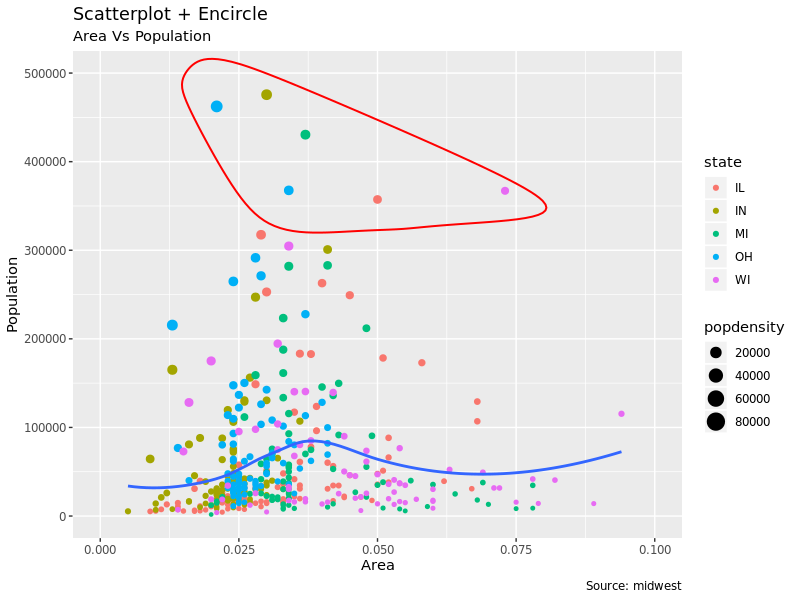
1.2 Scatterplot With Encircling
有时候在点图里我们会相对一些特别的点在散点画个框圈起来。这需要用到 ggalt 包的 geom_encircle() 函数。
和第二部分里给部分点加标志类似,我们相对部分点加框的话,需要首先生成一个新的数据,然后在这些数据上用 geom_encircle()
来画框。同时我们一般应该把框线加上一点 expand 好让它画到点的外面去。框线颜色和粗细可以使用 color 和
size 来设置:
 1
 2
 3
 4
 5
 6
 7
 8
 9
10
11
12
13
14
15
16
17
18
19
20
21
22
|
library("ggalt")
midwest_select <- midwest[midwest$poptotal > 350000 &
                            midwest$poptotal <= 500000 &
                            midwest$area > 0.01 &
                            midwest$area < 0.1,]

# Plot
ggplot(midwest, aes(x = area, y = poptotal)) +
  geom_point(aes(col = state, size = popdensity)) +   # draw points
  geom_smooth(method = "loess", se = F) +
  xlim(c(0, 0.1)) +
  ylim(c(0, 500000)) +   # draw smoothing line
  geom_encircle(aes(x = area, y = poptotal),
    data = midwest_select,
    color = "red",
    size = 2,
    expand = 0.08) +   # encircle
  labs(subtitle = "Area Vs Population",
    y = "Population",
    x = "Area",
    title = "Scatterplot + Encircle",
    caption = "Source: midwest")
|
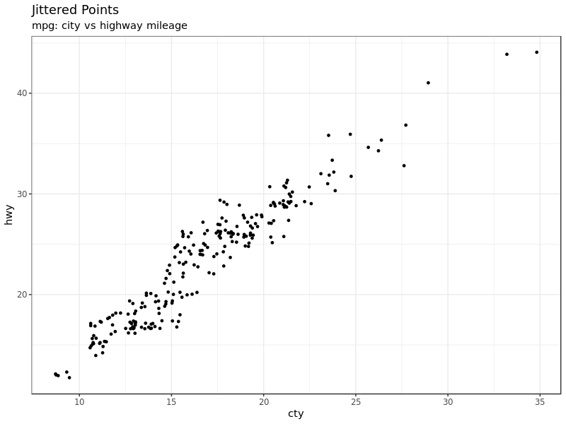
1.3 Jitter Plot
我们再用 mpg 数据来画个图:
 1
 2
 3
 4
 5
 6
 7
 8
 9
10
11
12
13
|
data(mpg, package = "ggplot2") # alternate source: "http://goo.gl/uEeRGu")
theme_set(theme_bw())  # pre-set the bw theme.

g <- ggplot(mpg, aes(cty, hwy))

# Scatterplot
g + geom_point() +
  geom_smooth(method = "lm", se = FALSE) +
  labs(subtitle = "mpg: city vs highway mileage",
    y = "hwy",
    x = "cty",
    title = "Scatterplot with overlapping points",
    caption = "Source: midwest")
|
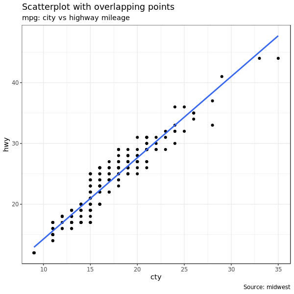
cty 和 hwy 高度相关。但是有些信息被隐藏了。
1
2
3
4
5
6
7
|
g + geom_point(alpha = 1 / 10) +
  geom_smooth(method = "lm", se = F) +
  labs(subtitle = "mpg: city vs highway mileage",
    y = "hwy",
    x = "cty",
    title = "Scatterplot with overlapping points",
    caption = "Source: midwest")
|
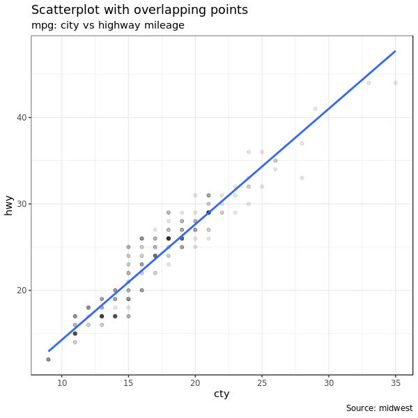
调整透明度就可以发现很多点其实重合了。
要解决点太多做图的时候发生重合的问题,就要用 jitter_geom(),jitter 是抖动的意思,这个做图命令就是让做图时点可以在
width 参数控制下随机发生一些 “抖动”,这样就有效避免了点之间发生重合的问题。
1
2
3
4
5
6
|
g <- ggplot(mpg, aes(cty, hwy))
g + geom_jitter(width = .5, size = 1) +
  labs(subtitle = "mpg: city vs highway mileage",
    y = "hwy",
    x = "cty",
    title = "Jittered Points")
|
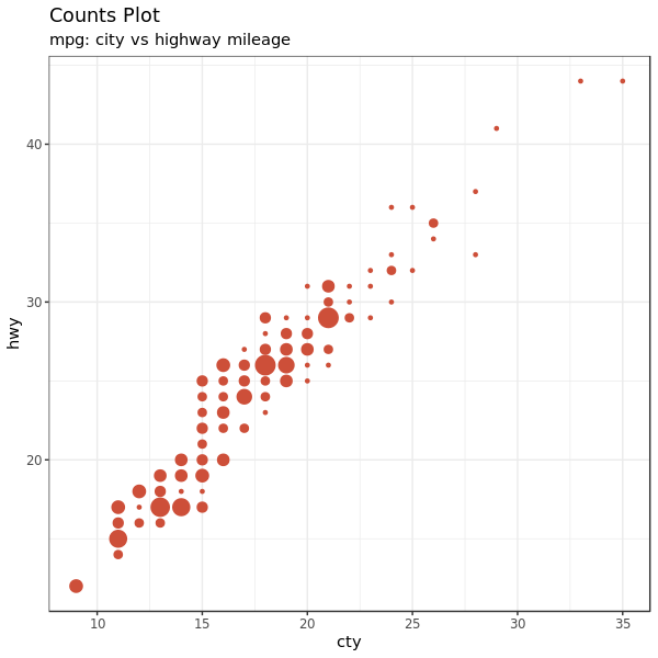
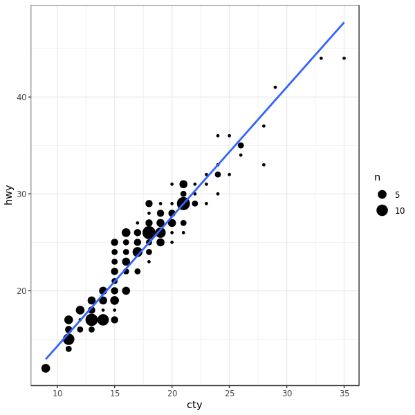
1.4 Counts Chart
还有一种办法,就是把重叠的点的多少映射到点的大小上。一个点越大代表这个点位置上重复的点越多。
1
2
3
4
5
6
7
8
9
|
data(mpg, package = "ggplot2")

theme_set(theme_bw())  # pre-set the bw theme.
g <- ggplot(mpg, aes(cty, hwy))
g + geom_count(col = "tomato3", show.legend = FALSE) +
  labs(subtitle = "mpg: city vs highway mileage",
    y = "hwy",
    x = "cty",
    title = "Counts Plot")
|
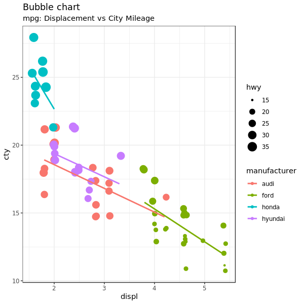
1.5 Bubble plot
散点图对于查看两个连续变量的关系很有用,而气泡图在此基础上还可以添加一个组别信息,比如:
- 用另一个分类变量来作为气泡的颜色,或者
- 用另一个连续变量来作为气泡的大小
简单的说,气泡图相对于散点图增加了数据维度,展示了更多信息。适用于在散点图基础上还有
分类变量分组(映射到颜色),或者还有一个连续变量(映射到点的大小)。
简言之,气泡图更适合展示 4 维数据,其中 X、Y均为数值型,另外还有一个分类变量(映射到颜色)和数值变量(映射到点大小)的情况。
 1
 2
 3
 4
 5
 6
 7
 8
 9
10
11
12
13
14
|
# load package and data
library("ggplot2")
data(mpg, package = "ggplot2")

mpg_select <-  mpg[mpg$manufacturer %in% c("audi", "ford", "honda", "hyundai"),]

# Scatterplot
theme_set(theme_bw())  # pre-set the bw theme.
g <- ggplot(mpg_select, aes(displ, cty)) +
  labs(subtitle = "mpg: Displacement vs City Mileage",
       title = "Bubble chart")

g + geom_jitter(aes(col = manufacturer, size = hwy)) +
  geom_smooth(aes(col = manufacturer), method = "lm", se = FALSE)
|
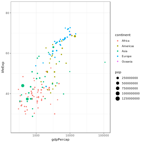
1
2
3
4
5
6
7
8
9
|
library("ggplot2")
library("gganimate")
library("gapminder")
theme_set(theme_bw())  # pre-set the bw theme.

p <- ggplot(gapminder, aes(gdpPercap, lifeExp, size = pop, color = continent)) +
  geom_point() + scale_x_log10()

p + transition_time(year)
|
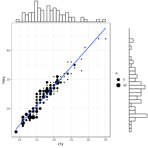
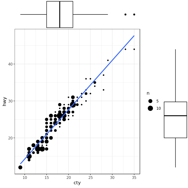
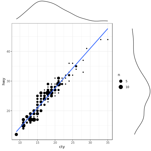
1.6 Marginal Histogram / Boxplot
如果想要在一幅图里既显示变量之间的关系,同时又显示变量的分布情况,这时候就可以使用边缘直方图。做法是在 X/Y
轴的边缘画上相应变量分布情况的直方图。
需要用到的是 ggExtra 包的 ggMarginal() 函数。除了在边缘添加 histgram 之外,我们还可以通过 type
参数指定画 boxplot、density。
 1
 2
 3
 4
 5
 6
 7
 8
 9
10
11
|
library("ggplot2")
library("ggExtra")
data(mpg, package="ggplot2")

# Scatterplot
theme_set(theme_bw())  # pre-set the bw theme.
mpg_select <- mpg[mpg$hwy >= 35 & mpg$cty > 27, ]
g <- ggplot(mpg, aes(cty, hwy)) +
  geom_count() +
  geom_smooth(method="lm", se=FALSE)
plot(g)
|
加 histogram:
1
|
ggMarginal(g, type = "histogram", fill="transparent")
|
加 boxplot:
1
|
ggMarginal(g, type = "boxplot", fill="transparent")
|
以及加 density:
1
|
ggMarginal(g, type = "density", fill="transparent")
|
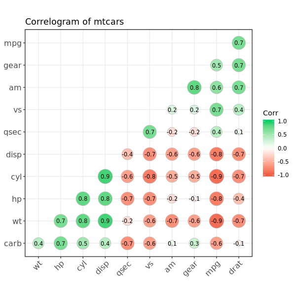
1.7 Correlogram
相关图可以同时展示一个数据里多个连续变量的相关情况
 1
 2
 3
 4
 5
 6
 7
 8
 9
10
11
12
13
14
|
library("ggcorrplot")
# Correlation matrix
data(mtcars)
corr <- round(cor(mtcars), 1)

# Plot
ggcorrplot(corr, hc.order = TRUE,
           type = "lower",
           lab = TRUE,
           lab_size = 3,
           method="circle",
           colors = c("tomato2", "white", "springgreen3"),
           title="Correlogram of mtcars",
           ggtheme=theme_bw)
|
2. Deviation
比较数据之间相对于某个固定参照的差异的大小。这句话有点绕,意思也传达得不够明白。看例子就很好懂了。
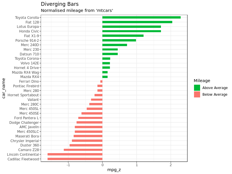
2.1 Diverging bars
差别条形图 (不知道这个图中文到底叫什么) 可以同时展示正值和负值。这是通过 geom_bar() 来实现的,但是这个用法有点奇怪。因为 geom_bar() 既可以用来画条图,也能用来画直方图。
默认情况下 geom_bar() 的 stat 参数设置为 count,所以我们只需要提供一个连续型数据作为 X 参数,Y 参数不需要,然后 ggplot 会自动根据 X 画出直方图。但是如果我们想要画条形图而不是直方图,就需要调整做图命令:
- 设置
stat = "identity"
aes() 里 X 和 Y 都要提供,X 是 character 或 factor,Y 是数值型
同时为了保证最后得到的是差别条图而不是普通的条图,要保证 X 在 Y 这个连续型变量达到某个特定阈值的时候发生变化使得 X 的值一共包括两个类别。下面的例子中,我们把 mtcars 数据中的 mpg 经过 z-score 标准化(标准化之后刚好就会一半正一半负,这就是前面这一句话说的过程),然后 mpg 为正的为绿色,负的红色。
 1
 2
 3
 4
 5
 6
 7
 8
 9
10
11
12
13
14
15
16
17
18
19
20
21
22
23
24
|
library("ggplot2")
theme_set(theme_bw())

# Data Prep
data("mtcars")  # load data
# create new column for car names
mtcars$car_name <- rownames(mtcars)
# compute normalized mpg
mtcars$mpg_z <- round((mtcars$mpg - mean(mtcars$mpg)) / sd(mtcars$mpg), 2)
# above / below avg flag
mtcars$mpg_type <- ifelse(mtcars$mpg_z < 0, "below", "above")
mtcars <- mtcars[order(mtcars$mpg_z),]  # sort
# convert to factor to retain sorted order in plot.
mtcars$car_name <- factor(mtcars$car_name, levels = mtcars$car_name)

# Diverging Barcharts
ggplot(mtcars, aes(x = car_name, y = mpg_z, label = mpg_z)) +
    geom_bar(stat = 'identity', aes(fill = mpg_type), width = .5)  +
    scale_fill_manual(name = "Mileage",
        labels = c("Above Average", "Below Average"),
        values = c("above" = "#00ba38", "below" = "#f8766d")) +
    labs(subtitle = "Normalised mileage from 'mtcars'",
         title = "Diverging Bars") +
    coord_flip()
|
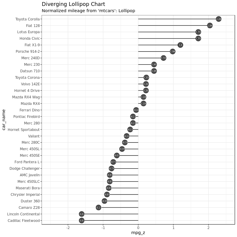
2.2 Diverging Lollipop Chart
棒棒糖图和条图、差别条图显示的信息其实是一样的,只不过棒棒糖图看起来更摩登一点而已。这里我没有用 geom_bar(),而是用 geom_point + geom_segment 的方式使图和棒棒糖外观更接近。数据我们还是用上面的数据:
 1
 2
 3
 4
 5
 6
 7
 8
 9
10
|
ggplot(mtcars, aes(x = car_name, y = mpg_z, label = mpg_z)) +
    geom_point(stat = 'identity', fill = "black", size = 6, alpha = 0.7)  +
    geom_segment(aes(y = 0, x = car_name,
                     yend = mpg_z, xend = car_name),
                 color = "black") +
    geom_text(color = "white", size = 2) +
    labs(title = "Diverging Lollipop Chart",
         subtitle = "Normalized mileage from 'mtcars': Lollipop") +
    ylim(-2.5, 2.5) +
    coord_flip()
|
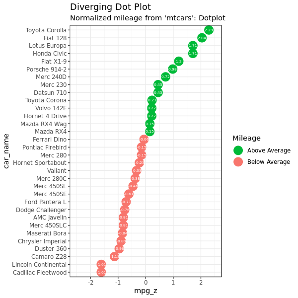
2.3 Diverging Dot Plot
看了上面的棒棒糖图,点图就更简单了,基本上就是去掉下面的 geom_segment:
 1
 2
 3
 4
 5
 6
 7
 8
 9
10
|
ggplot(mtcars, aes(x = car_name, y = mpg_z, label = mpg_z)) +
    geom_point(stat = 'identity', aes(col = mpg_type), size = 6)  +
    scale_color_manual(name = "Mileage",
                       labels = c("Above Average", "Below Average"),
                       values = c("above" = "#00ba38", "below" = "#f8766d")) +
    geom_text(color = "white", size = 2) +
    labs(title = "Diverging Dot Plot",
         subtitle = "Normalized mileage from 'mtcars': Dotplot") +
    ylim(-2.5, 2.5) +
    coord_flip()
|
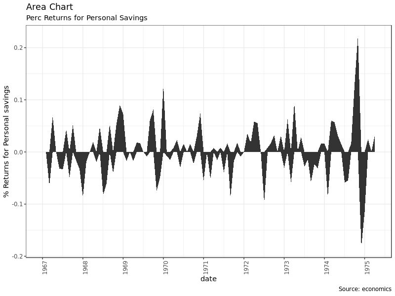
2.4 Area Chart
面积图常常用来展示某个指标相对于基线情况的变化(比如股票的回报率)。面积图用 geom_area() 来画:
 1
 2
 3
 4
 5
 6
 7
 8
 9
10
11
12
13
14
15
16
17
18
19
20
21
|
library("ggplot2")
library("quantmod")
data("economics", package = "ggplot2")

# Compute % Returns
economics$returns_perc <-
    c(0, diff(economics$psavert) / economics$psavert[-length(economics$psavert)])

# Create break points and labels for axis ticks
brks <- economics$date[seq(1, length(economics$date), 12)]
lbls <- lubridate::year(economics$date[seq(1, length(economics$date), 12)])

# Plot
ggplot(economics[1:100,], aes(date, returns_perc)) +
    geom_area() +
    scale_x_date(breaks = brks, labels = lbls) +
    theme(axis.text.x = element_text(angle = 90)) +
    labs(title = "Area Chart",
        subtitle = "Perc Returns for Personal Savings",
        y = "% Returns for Personal savings",
        caption = "Source: economics")
|
3. Ranking
比较不同项目之间位置、表现的,可能各项目具体取值相比项目之间相互关系没那么重要。举例看更明白:
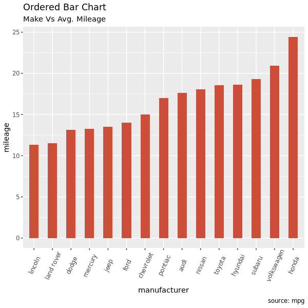
3.1 Ordered Bar Chart
有序条图。条图根据 Y 的取值进行排序。只对数据的感兴趣的列进行排序并不能达到画出有序条图的效果(因为画图的时候条图的顺序是按照 X 取值自动排列的)。因此,我们需要把 X 转化成因子,因子的排序就是我们想要的 Y 轴取值顺序就行了。
看例子吧,我们对 mpg 数据以 manufacturer 分组对 cty 取均值,但是要求最后画条图以均值大小排序:
1
2
3
4
5
6
7
8
9
|
library("dplyr")
library("magrittr")
cty_mpg <- mpg %>%
    group_by(manufacturer) %>%
    summarise(mileage = mean(cty)) %>%
    arrange(mileage)
cty_mpg$manufacturer <- factor(cty_mpg$manufacturer,
                               levels = cty_mpg$manufacturer)  # to retain the order in plot.
head(cty_mpg, 4)
|
数据:
1
2
3
4
5
6
7
|
# A tibble: 4 x 2
  manufacturer mileage
  <fct>          <dbl>
1 lincoln         11.3
2 land rover      11.5
3 dodge           13.1
4 mercury 13.2 |
可以看到我们在数据上首先 arrange() 对 Y 值排序之后,再 factor() 把这个数据传递到 X 轴,这样画图就是按照我们预想的,以 Y 取值大小来排序了:
1
2
3
4
5
6
|
ggplot(cty_mpg, aes(x = manufacturer, y = mileage)) +
    geom_bar(stat = "identity", width = .5, fill = "tomato3") +
    labs(title = "Ordered Bar Chart",
         subtitle = "Make Vs Avg. Mileage",
         caption = "source: mpg") +
    theme(axis.text.x = element_text(angle = 65, vjust = 0.6))
|
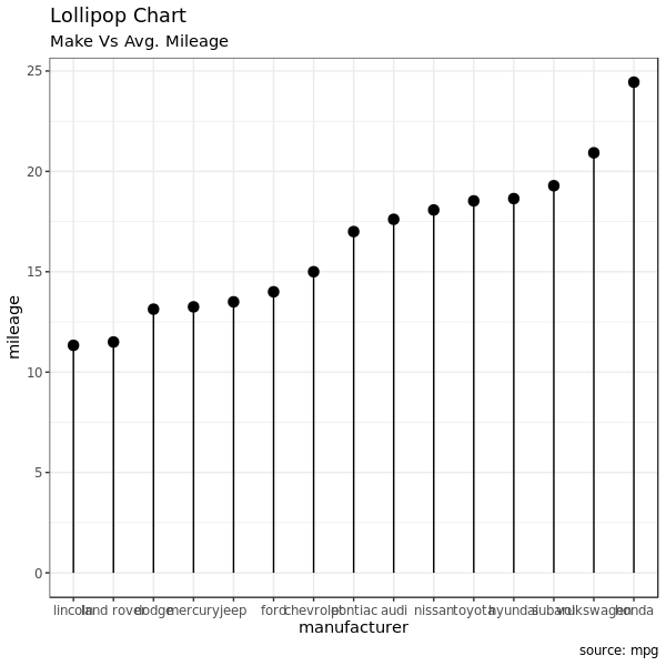
3.2 Lollipop Chart
棒棒糖图和图表没有本质的差别。只是把条图的条换成了细线,而顶端的点用来强调取值。棒棒糖图比条图看起来更加优美现代,还是上面一样的数据变成棒棒糖图:
 1
 2
 3
 4
 5
 6
 7
 8
 9
10
|
ggplot(cty_mpg, aes(x = manufacturer, y = mileage)) +
    geom_point(size = 3) +
    geom_segment(aes(
        x = manufacturer, xend = manufacturer,
        y = 0, yend = mileage)) +
    labs(title = "Lollipop Chart",
         subtitle = "Make Vs Avg. Mileage",
         caption = "source: mpg") +
    theme(axis.text.x = element_text(angle = 65, vjust = 0.6)) +
    theme_bw()
|
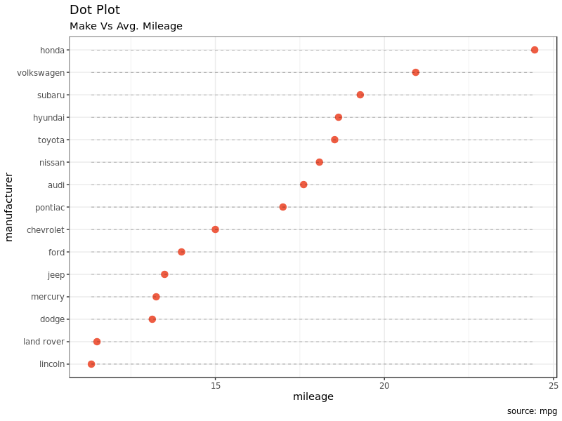
3.3 Dot Plot
点图(其实这里翻译为点图不是很合适)和棒棒糖图很像,只是去掉了点下面的线,然后把 X/Y 对调了位置。这种图更加强调各项目之间取值排序的情况以及根据取值各个项目之间相比较的总体情况。仍然是前面的数据再换成点图看看:
 1
 2
 3
 4
 5
 6
 7
 8
 9
10
11
12
|
ggplot(cty_mpg, aes(x = manufacturer, y = mileage)) +
    geom_point(col = "tomato2", size = 3) +   # Draw points
    geom_segment(aes(
        x = manufacturer, xend = manufacturer,
        y = min(mileage), yend = max(mileage)),
        linetype = "dashed",
    size = 0.1) +   # Draw dashed lines
    labs(title = "Dot Plot",
         subtitle = "Make Vs Avg. Mileage",
         caption = "source: mpg") +
    coord_flip() +
    theme_bw()
|
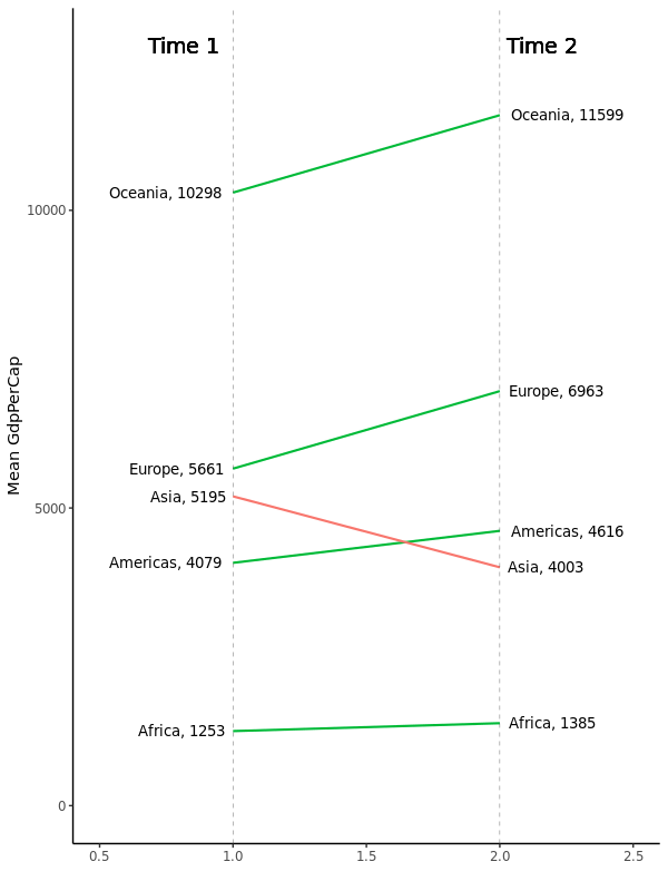
3.4 Slope Chart
坡度图(不知道中文到底叫什么)对于展示数据在两个时间点之间变化情况非常合适。但是目前还没有内建的画图函数,我们只能自己来实现:
 1
 2
 3
 4
 5
 6
 7
 8
 9
10
11
12
13
14
15
16
17
18
19
20
21
22
23
24
25
26
27
28
29
30
31
32
33
34
35
36
37
38
39
40
41
42
43
44
45
46
47
48
49
|
library("scales")
df <- read.csv("https://raw.githubusercontent.com/selva86/datasets/master/gdppercap.csv")
df

#   continent X1952 X1957
# 1    Africa  1253  1385
# 2  Americas  4079  4616
# 3      Asia  5195  4003
# 4    Europe  5661  6963
# 5   Oceania 10298 11599

left_label <- paste(df$continent, round(df$`1952`),sep=", ")
right_label <- paste(df$continent, round(df$`1957`),sep=", ")
df$class <- ifelse((df$`1957` - df$`1952`) < 0, "red", "green")

p <- ggplot(df) + geom_segment(
    aes(x = 1, xend = 2, y = `1952`, yend = `1957`, col = class),
        size = .75,
        show.legend = FALSE) +
    geom_vline(xintercept = 1, linetype = "dashed", size = .1) +
    geom_vline(xintercept = 2, linetype = "dashed", size = .1) +
    scale_color_manual(labels = c("Up", "Down"),
        values = c("green" = "#00ba38", "red" = "#f8766d")) +  # color of lines
    labs(x = "", y = "Mean GdpPerCap") +  # Axis labels
    xlim(.5, 2.5) + ylim(0, (1.1 * (max(df$`1952`, df$`1957`))))  # X and Y axis limits

# Add texts
p <- p + geom_text(label = left_label,
                   y = df$`1952`, x = rep(1, NROW(df)),
                   hjust = 1.1, size = 3.5)
p <- p + geom_text(label = right_label,
                   y = df$`1957`,
                   x = rep(2, NROW(df)),
                   hjust = -0.1, size = 3.5)
p <- p + geom_text(label = "Time 1",
                   x = 1, y = 1.1 * (max(df$`1952`, df$`1957`)),
        hjust = 1.2, size = 5)  # title
p <- p + geom_text(label = "Time 2",
                   x = 2, y = 1.1 * (max(df$`1952`, df$`1957`)),
                   hjust = -0.1,size = 5)  # title

# Minify theme
p + theme(panel.background = element_blank(),
    panel.grid = element_blank(),
    axis.ticks = element_blank(),
    axis.text.x = element_blank(),
    panel.border = element_blank(),
    plot.margin = unit(c(1, 2, 1, 2), "cm")) +
    theme_classic()
|
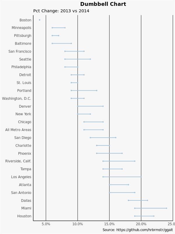
3.5 Dumbbell Plot
哑铃图对于以下两种情况很实用:
为了哑铃的顺序,Y 应该是一个因子而且因子的 level 应该对应图上的顺序:
 1
 2
 3
 4
 5
 6
 7
 8
 9
10
11
12
13
14
15
16
17
18
19
20
21
22
23
24
25
26
27
28
29
30
31
|
library(ggalt)

health <- read.csv("https://raw.githubusercontent.com/selva86/datasets/master/health.csv")
health
#                 Area pct_2014 pct_2013
# 1            Houston     0.19     0.22
# 2              Miami     0.19     0.24
# 3             Dallas     0.18     0.21
# 4        San Antonio     0.15     0.19
# 5            Atlanta     0.15     0.18
# 6        Los Angeles     0.14     0.20
# 7              Tampa     0.14     0.17
# 8  Riverside, Calif.     0.14     0.19
# 9            Phoenix     0.13     0.17
# 10         Charlotte     0.13     0.15
# 11         San Diego     0.12     0.16
# 12   All Metro Areas     0.11     0.14
# 13           Chicago     0.11     0.14
# 14          New York     0.10     0.12
# 15            Denver     0.10     0.14
# 16  Washington, D.C.     0.09     0.11
# 17          Portland     0.09     0.13
# 18         St. Louis     0.09     0.10
# 19           Detroit     0.09     0.11
# 20      Philadelphia     0.08     0.10
# 21           Seattle     0.08     0.12
# 22     San Francisco     0.08     0.11
# 23         Baltimore     0.06     0.09
# 24        Pittsburgh     0.06     0.07
# 25       Minneapolis     0.06     0.08
# 26            Boston     0.04     0.04
|
然后做图:
 1
 2
 3
 4
 5
 6
 7
 8
 9
10
11
12
13
14
15
16
17
18
19
20
21
22
23
24
25
26
27
28
|
# for right ordering of the dumbells
health$Area <- factor(health$Area,
                      levels = as.character(health$Area))

gg <- ggplot(health, aes(x = pct_2013,
        xend = pct_2014,
        y = Area,
        group = Area)) +
    geom_dumbbell(color = "#a3c4dc",
                  size = 0.75,
                  point.colour.l = "#0e668b") +
    scale_x_continuous(label = percent) +
    labs(x = NULL,
        y = NULL,
        title = "Dumbbell Chart",
        subtitle = "Pct Change: 2013 vs 2014",
        caption = "Source: https://github.com/hrbrmstr/ggalt") +
    theme_classic() +
    theme(plot.title = element_text(hjust = 0.5, face = "bold"),
        plot.background = element_rect(fill = "#f7f7f7"),
        panel.background = element_rect(fill = "#f7f7f7"),
        panel.grid.minor = element_blank(),
        panel.grid.major.y = element_blank(),
        panel.grid.major.x = element_line(),
        axis.ticks = element_blank(),
        legend.position = "top",
        panel.border = element_blank())
plot(gg)
|
这一部分到这里才大概一半,但是已经很长了,先到这里。最后的一点随缘更新了,再见。
文章作者
Jackie
上次更新
2019-03-05
(876c7b3)